I used software to track my time: I tracked app usage through Screen Time, desktop browser usage through an app called “Clockify”, Apple Podcasts to track which Podcasts I listened to, and a Google Sheet to track TV, reading, and video game time.
Inspired by Ethan’s exhortation to avoid using Microsoft Excel to visualize our media diet, I decided to use Microsoft Excel to visualize my media diet. I remembered reading about the Japanese artist Tatsuo Horiuchi using Excel to create paintings with the Autoshape tool, and tried to create something similar. Unfortunately, making beautiful art is hard:
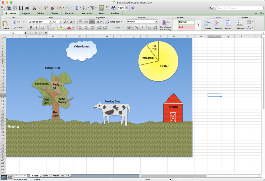
In this painting, I represented the amount of time I spent consuming media with various items in a landscape. The overall canvas size represents all the time in one week. Each item’s size roughly corresponds to the amount of time spent on that activity. The grass represents time spent sleeping, the sun represents time spent on social media, and the Reading Cow represents time spent reading news, books, or papers. True to the Excel form, I turned the sun into a pie chart. The sizes are inexact: I tried to write some VBScript to calculate the area of an arbitrary polygon but this turned out to be nontrivial, so I decided to spend more time sleeping instead.
One valuable lesson I learned from this exercise is that I do not have the patience or artistic skills of Tatsuo Horiuchi. Another is that I spend a lot of time on Twitter, which is a website that makes me unhappy, and that I should stop doing that.
Here’s the spreadsheet, if you’re interested. The art looks bad in the Google Drive viewer, but if you have Excel you can download the .xlsx file and open it.