“To read Rookie was to be seen and to find a place where perhaps the most affirming comment section on the Internet empathized with conflicting feelings. Through personal stories, illustrations, photo essays, interviews, and experimental media, young people’s formative insights into identity and growing up were treated with validity and care instead of condescension and preachiness. Rookie cultivated a rare space where readers could examine what it means to be a person in their own small worlds and in the wider world around them.” [1]
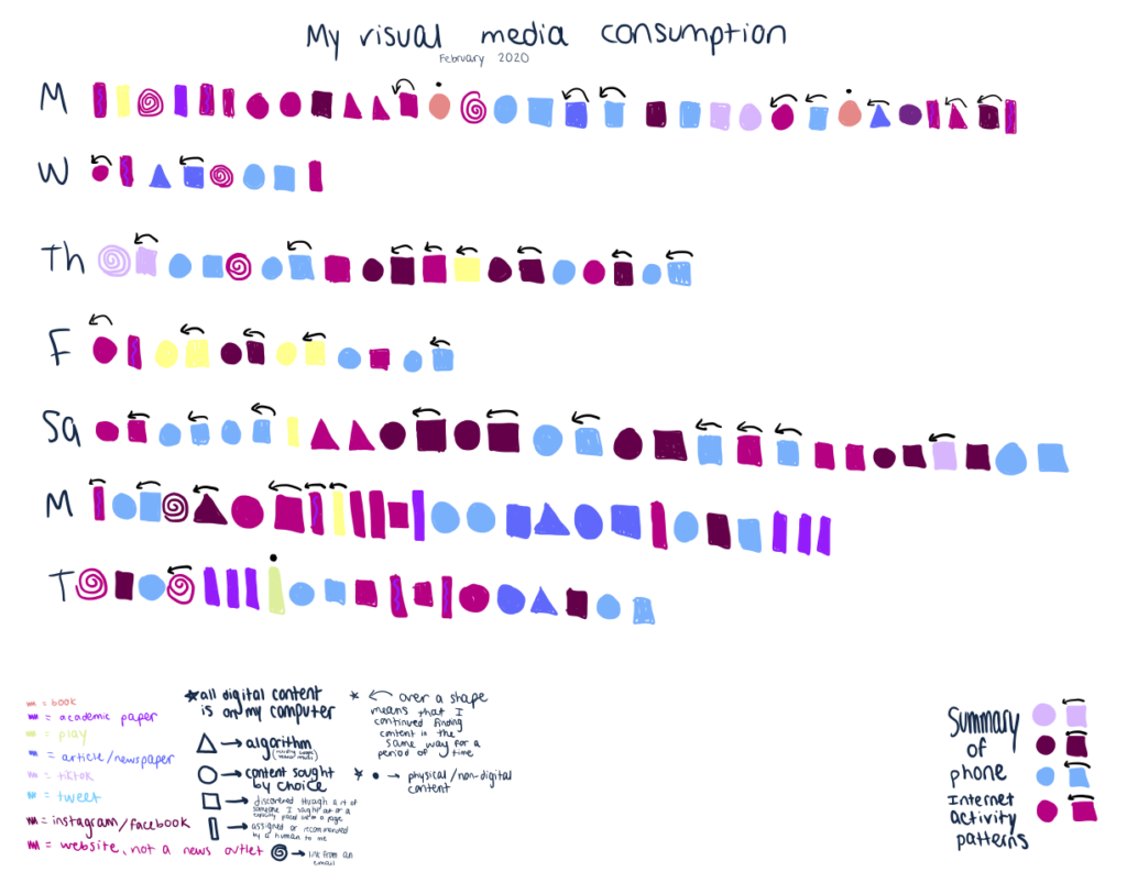
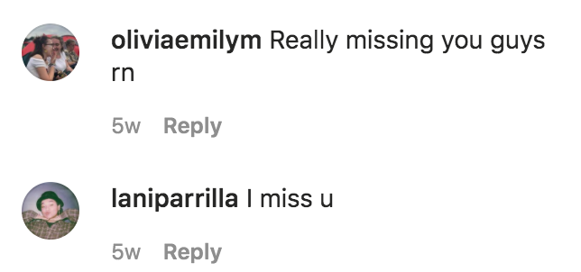
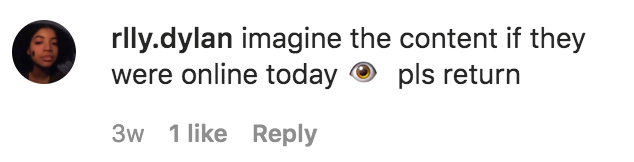
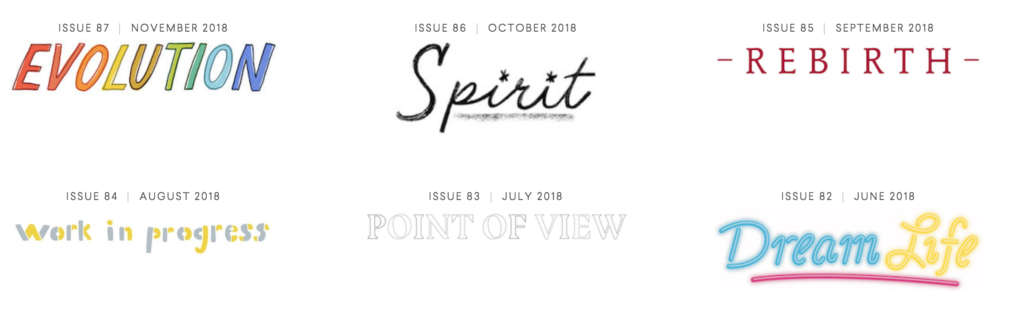
Rookie was an online magazine for and by teenagers (you can check out the archive here!). It was founded by Tavi Gevinson in 2011, and thousands of articles, essays, poems, advice columns, stories, diary entries, interviews, photos, illustrations, comics, collages, playlists, and videos were published in 87 digital issues until 2018. I don’t remember exactly how I discovered it, but I definitely luckily stumbled upon it through the Internet. I do know that it felt like a distinctive, concrete place that I wanted to be a part of, even if only by reading. Rookie was shut down in 2018 ultimately not because of a lack of community or readers, but because Rookie’s model (which I will argue, helped make it a healthy community) was not financially sustainable. Digital media publications are in a difficult situation now in 2020 – some may ask what the point of maintaining an online media publication is when posts can be shared and community can be created through social media? Rookie had a conflict between growth and money & creative control and community. However, the publication was good at maintenance and stewardship [which unfortunately is usually not valued in a capitalist industry]. Social media has not quite replaced what Rookie did so well. It’s easy to see how big of an impact Rookie had on its community by reading the comments on the final editors’ letter or odes in various other publications and posts on social media about “the end of Rookie”. As we are all quarantined, people are returning to Rookie’s archives and Rookie’s final Instagram post to comment that they miss it and wish it existed right now. Rookie was a place free from marketing and self-promotion and commercialized wokeness, where (any teenager, but mostly those who did not identify as male) could fully explore and be themselves and ask weird questions to other humans, rather than to Google. It was not perfect, but it did not expect its readers or writers to be perfect either. I am going to explain how Rookie managed to do this, which in turn is what made Rookie a healthy online community:
Content – “the perfect mix of funny/loving/dark/angry/kind/sincere/visually pleasing” [2]
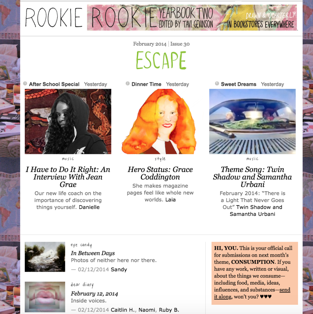
Rookie’s content was created by and for the community. Content topics ranged from an interview with Lizzo (before she was popular in the mainstream) to the importance of being awkward, to dealing with grief, to fashion hacks, to growing up. Rookie did not talk down to its audience – it did not tell young people to wait their turn, did not belittle the experiences of young people, and did not not tell young people to idolize anyone or feed the cult of celebrity to them. Adults who contributed content did not talk down at all to the mostly teenage audience. Everyone was met on their level, as a person. People (mostly teenagers and young adults) were open and honest about their experiences. There were few interviews with celebrities (look at the main pages of Seventeen and Teen Vogue and you will see the difference immediately). “Normal” people’s stories had exactly the same weight as those of people who are more heralded on other platforms.
There was smart, intellectual content and vulnerable pieces and tons of q & a’s and guides to fashion and makeup, and none of those categories were mutually exclusive from each other. The site definitely had more of an exploratory rather than expert vibe, and reading each piece felt like receiving advice from a friend. I was able to read about other people’s lives, but in a “peering through a window into what makes a person who they are” way rather than in a self promotional, “please look at what I am doing” way. The content was a way to approachably learn from people who may have been a bit ahead of you in life, but were not leaps and bounds away. If someone not from the intended audience was on the site, I think that they felt like they had to respect boundaries and learn.
Importantly, Rookie also was not the news. Articles leaned more toward digested or detailing experiences in-process rather than immediate reactions to something. Since people would share mistakes they had made or learned from, and would validate others’ experiences, no matter how small, the website felt like a safe place where it was ok to be vulnerable. Tavi shared this quote in her final editor’s letter which reflects this: “I get a visceral reminder of how it felt to be in middle school, when I wondered if other people shared my fears, insecurities, ambitions, weird habits, enthusiasms. If I would ever meet them. The fact that this is no longer a question in my mind makes me feel utterly spoiled. That is thanks to you, and it means more than I can say.“ [2]
Content for people, not consumers
Rookie was created in direct opposition to how other teenage magazines marketed to young people, which made them feel “seen as a consumer rather than a reader or person”[2]. There was minimal advertising through banner ads at the top of the page and the side of the page that did not intrude upon the reading experience. The advertisements were selectively curated and did not seem to rely on user tracking – for example, I remember seeing numerous ads of book titles. Unlike other magazines owned by media conglomerates, Rookie had no airbrushing of models (and no models at all) and no pages of (expensive) products that readers should buy. Beauty and style were covered on the site, but not to make the site money through commissions through clicked links or purchases or make a reader feel like they needed to be something or meet a certain ideal.
“I was a teenager living on a tiny island, and reading your articles and finding out that there were people out there who thought like me, who thought about so much more than me, really shaped who I became. I never made friends through Rookie; I never had any submissions posted; I never drew from it to launch my own artistic brand. But Rookie encouraged me to think more, to be more creative and introspective, and to consider things that were so much bigger than myself.” (comment on [2])
Being its own site
I think this is actually a really powerful decision design wise, because it serves as an explicit reminder of the norms of the community. On Twitter and other social media platforms, different subcommunities may have different norms, but there is no guarantee that people will not behave in different ways since the community is not contained and anyone can enter the community at any time without a clear boundary. Also, the norms of the broader platform can supercede community norms. Many new “publications” are now hosted on blogs like Medium. However, Medium explicitly encourages content to be seen by as many eyeballs as possible. Rookie’s content was not really intended to be shared on social media or be promoted somewhere else or to receive 1000000 views or result in fame or etc. It was written for the community that knew where to find it and would be excited to receive it. Rookie writers contributed pieces to help contribute to a whole, rather than pieces that would exist individually across the Internet.
Amount of content and theme of site
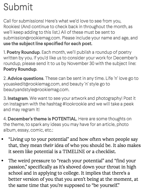
Only 6 articles were uploaded per day, and each month had a different theme. Tavi would write an editor’s letter for each theme, and prompts to spark ideas of what to write about were provided on the submit page. The recommendations for content to read was inherently all of the content that was published by design. The editorial staff shaped the vibes of the site, not a ranking system through user engagement with algorithms.
The structure of the website
Rookie truly felt like a place to go to, unlike the bottomless pits of social media platforms. Although the site only had a comment section and no other avenues of direct communication, it still felt like a community. The website was content-driven rather than user-driven — the intent of the website was not to meet other people (although people did venture outside of the bounds of the website and become friends, especially if they became writers), but to share and process life together. No followers, likes, or other metrics existed on the readers’ UI. The content was not showcased by what was popular right now, but by what was released each day.
Empowerment by showcasing teenagers’ work
A lot of writers have said that Rookie was the first place where their work was published. They felt validated as writers, artists, and creators. Rookie paid writers if their work was published, but because everyone should be paid fairly for their work regardless of their age. Money was not the main incentive to publish. People wrote because they related to the content and wanted to share their own art and experiences with other people too. Rookie gave teenagers a platform that did not exist otherwise. From an ID article: “As editor, Tavi showed young women that not only their voices and opinions were valued, but there was a place for them to thrive and create. She opened up worlds that had previously existed behind closed doors, accessible by the very few. Many women now in their 20s witnessed Gevinson’s rise during their own teens and thought, ‘maybe I could do that too’. During its seven year tenure, the site launched and nurtured countless creative careers, and inspired many more.”[3]
Some caveats
Rookie felt non-exclusive as a reader, but was kind of exclusive in terms of publishing content due to the constraint of only uploading a certain number of pieces each day. Rookie had a fairly defined aesthetic, which contributed to the uniqueness of the site, but could be viewed as an ideal standard that had to be met by submissions. It became increasingly inclusive and intersectional over time, but it may not have been that way in its beginning stages. I was too intimidated to contribute despite being inspired by the community. Some of the features that helped establish the community were a result of the gate-keeping roles.
This quote is nice and describes how the Rookie readers themselves helped create the community simply by being themselves: “Besides, that next iteration of what Rookie stands for—the Rookie spirit, if you will—is already living on in you. You’ve made friends with each other. You’ve made your own zines, blogs, clubs, collectives, bands. … You didn’t need Rookie or me to do any of that, but maybe we gave you an extra nod of encouragement. You felt bad one night and read an article on here and then you felt better.” [2]
References:
- Mejía, Paula. Rookie Brought the Inclusive Spirit of Zines to the Internet Era. The New Yorker. 3 December 2018. https://newyorker.com/culture/culture-desk/rookie-brought-the-inclusive-spirit-of-zines-to-the-internet-era
- Gevinson, Tavi. Editor’s Letter. Rookie. 30 November 2018. https://www.rookiemag.com/2018/11/editors-letter-86/6/
- Gamble, Ione. What ‘Rookie’ Meant to a Generation of Young Female Writers. i-D. 8 December 2018. https://i-d.vice.com/en_uk/article/ev3mkj/closure-rookie-website