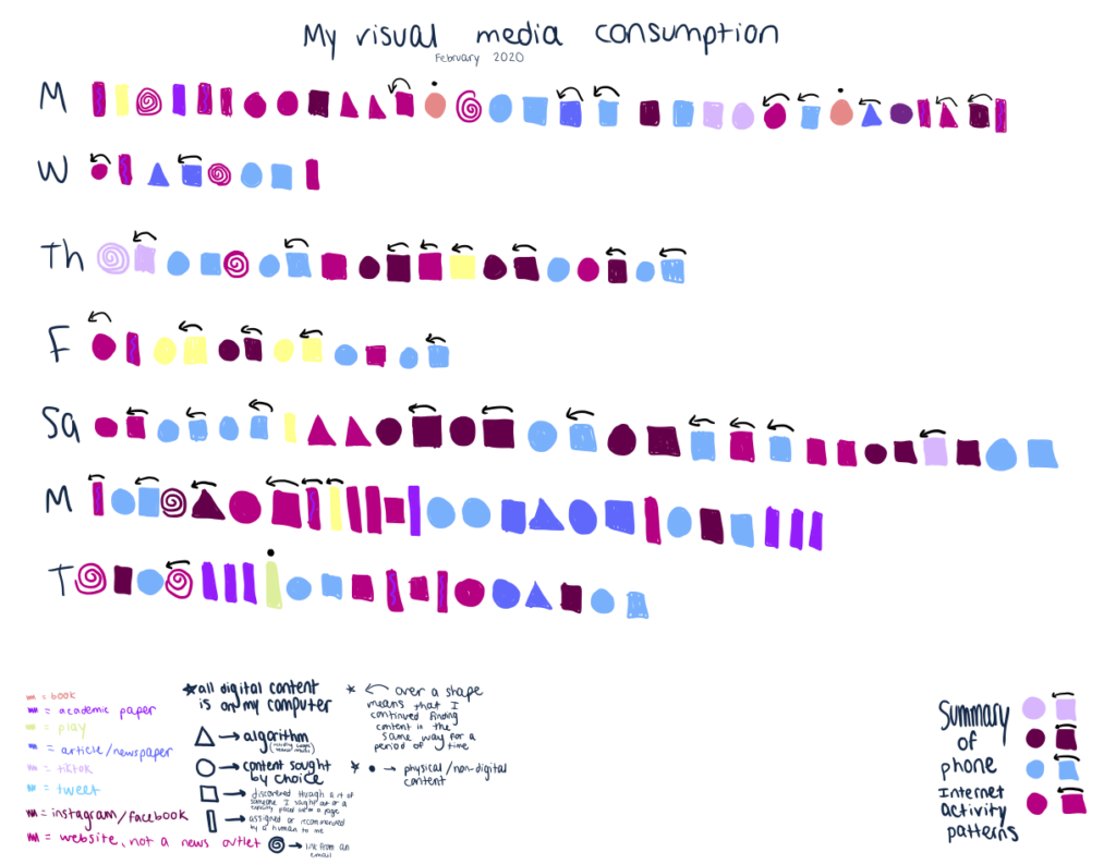
I decided to visualize how I was introduced to content and what kind of content I interacted with over the course of a week. The data was mostly visualized chronologically over the course of each day. I collected data for 9 days, but only chose to visualize 7 in my graphic (I worked on a take-home midterm all day on Sunday so my data was not that interesting). My visualization was inspired by Dear Data, a year-long analog data project between two friends. I did not include messages, email, or numerous instances of engaging with an academic website like Piazza or Canvas in my collected data. I did include academic readings online such as an online textbook. I included links that I clicked on through google searches but not the searches themselves. My visualization is not totally comprehensive as it does not indicate how long I interacted with content. I spent much more time on academic readings than on Twitter, but I have many more instances of Twitter content. I focused more on how I discovered the content than how many Tweets or TikToks (for instance) I interacted with – if I interacted with numerous Tweets in the same way, I simply drew one shape with an arrow drawn over it. It was funny to see my habit of going to check a specific account whose information I enjoy reading when I need to fill a gap of time or want to distract myself, and then scrolling through that account and going down an Internet rabbit hole visualized. I indicated if I chose to find or interact with content, but I did not describe why – to fill time, to answer a question, to distract, etc.