Background
Before deciding on r/DataisBeautiful I looked into different communities where data is discussed. I first looked at news outlets such as The Upshot and The Economist and others. But from my initial observations about the discussions, while a number of the comments talked about the visualization, mostly comments went off on a tangent. Also most of these news outlets disable comments or allow them for a limited amount of time. And when they do, they are heavily moderated and toxic to the population who are not part of the group of moderations. Clearly, not a healthy community!
Given that type of moderation and selective harassment that get looked over in those news outlets, I felt it wasn’t a good choice for a “healthy” community. Mainly, what I care about is how people civilly discuss data visualizations and how they interact with them and with each other in a more focused and healthy community.
I found three communities that I had to choose from. I filtered them based on where most of the discussion happens and how saturated is the discussion in that community. The first one is VisGuides Figure 1. The idea of this forum is great in which visualization is discussed and criticized to produce guidelines that other members suggest to each other . However, not so much discussion happens there. When sorting the posts by the top ones, the highest one got 3 replies. That is not enough to explore the health and discourse of this community.
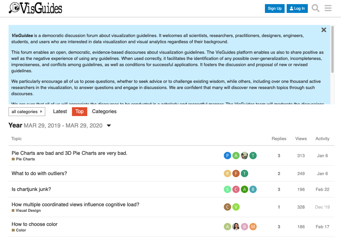
Figure1: VisGuides is a democratic discussion forum about visualization guidelines. Not so much discussion happens there. When sorting the posts by top, the highest one got 3 replies.
The second community that I considered is vis.social Figure 2, a twitter like community for data analytics and visualization. The problem with this community is members were deviating away from the main goal of the platform. Users are posting just like they are doing on twitter except for a few accounts which were true to the nature of the community. Due to the insufficient data discussions that happened there. I looked into what I perceive as the best community so far to discuss data visualization online. In the few sections I will show why!

r/DataisBeautiful
DataIsBeautiful is for visualizations that effectively convey information Figure 3. According to their definition of the community: it’s “a place to share and discuss visual representation of data: Graphis, charts, maps, etc.” The community lists many posts that are a composition of a visualization with a title and a description by the author of how it was made and his or her design rationale. In addition to that, users can comment on the main story and reply to each other. The community is for professionals and amateurs, experts and novices. I looked where the action is and it’s in the community itself in addition to “discord” (the chat community associates with it).

Figure 3: Home page of r/DataisBeautiful. Each post is a data story and community members get to participate and reply to that story and to each others.
The posting rules of this community are simple. Anyone can post as long as their post contains a data visualization, mention the source data and indicate if it’s their original contribution or not. As for commenting rules the norm is to be polite and avoid any hate speeches. In general, the social norms are standards and rules the are known by the community, enforced socially without legal or law enforcements. It’s how everyone is expected to behave in a community [2, 3]. Some of the healthy rules I will be describing in more detail in the following sections.
Methodology
In order to define the criteria I’m using to determine the health of the community I followed a mixed approach. I participated as a member and as an observer in r/dataisbeautiful. I used content analysis [6] and participation observation [3]. I wanted to ground my work so I coded the comments that happened on reddit. The first pass helped me identify the general healthy criteria in the community. My second pass was to saturate and confirm my codings.
Community Healthy Criteria
The main components I was looking at are: how sharing a visualization story triggers discussion, what kind of discussion and community energy from that.
Based on my qualitative analysis this is a list of the criteria of a healthy community that discussed data visualization online:
- A community must have a diverse set of Participants with different perspectives and goals
- A community must be a safe environment for learning and growing
- Community members should have the tendency to reproduce work and science
- Community member should participate in constructive criticism and collective effort to add knowledge
- Community discussions should ad more information to the story (insight, data,)
- Community moderation should be in Moderation
In the following section I will talk about each criteria and give examples from the community of choice r/dataisbeautiful
Diverse set of Participants
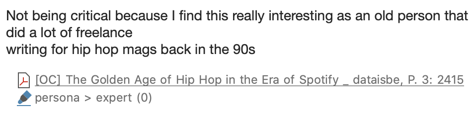
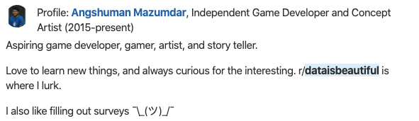
The type of users in this community range from experts to novices and amateurs to professionals. For example an expert in hip-hop and a professional writer in the field clearly explained his position and contributed to the discussion from his point of view Figure 4, replying to an audience that is mostly amateur in hiphop but more expert in data analysis and visualization
While some community members are experts in stats, some authors of the visualizations lack stats knowledge, they share a beautiful data story and ask for feedback on both the esthetics and the analysis. This diverse set of community members made it safe to clearly indicate what an author lacks and what kind of discussion or help they look for in relation to the story they have shared. Figure 5 & 6.
Given the nature of the community and the diverse experience and professional levels, a natural healthy behavior emerged in which I have observed in the discussion indicating “wanting to learn”, “how did you do this” ,”what software are you using etc.”. And more importantly, those who asked these questions have received answers. Which leads me to the second healthy point in this community.
Safe space to Learn
While some users learn from reading “lurking” comments, the experience is more rewarding when the original author of the story is part of the discussion and defending their decisions. Which is something we don’t see in other data story communities such as new papers, in which the reporter, the data journalist and the editor end their job when the story is published.
When looking at the discourse outside r/dataIsBeautiful Figure 7 this is the perception of the community in terms of learning. [10]

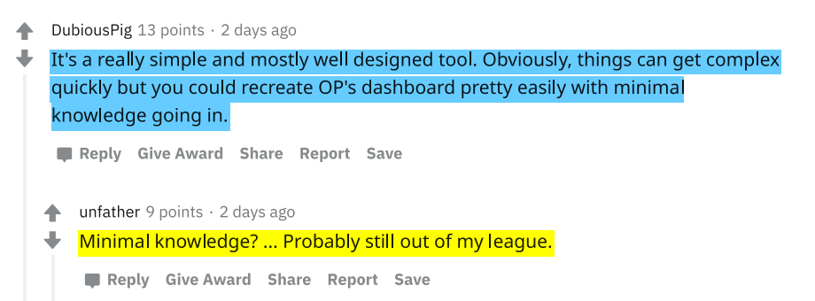
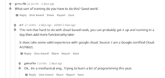
Looking at reddit bellow Figure 8 are quotes collected from the discussion about a COVID dashboard. The first comment is a user asking about the tool that made the chart, the other wants to understand how much training is involved to build such a tool and so on.

The following examples Figure 9 don’t just show that users want to learn through these discussions, but more importantly indicate what’s healthy, which is getting the proper reply and help these users are looking for without being shamed or ridiculed. Just like any safe learning environment.

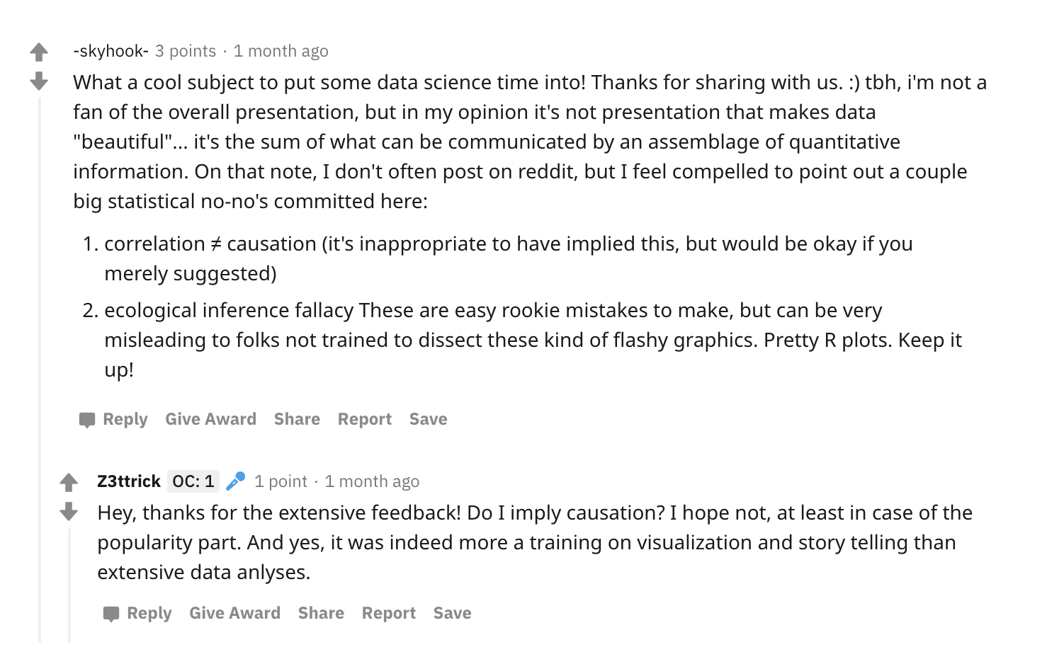
Finally, one interesting pattern is what manifested in this member’s comment Figure 10. He was observing an intense discussion about statistics and he expressed how these conversations are immensely useful in complementing the knowledge he received from his formal education.

Collective effort to Improve (Meta Commentary)
In this community I have observed interesting conversational interactions between authors and audience and among the audience themselves. The audience comment with suggestions, inquiries and feedback (on the visualization or the analysis) in which authors act on and sometimes share newer versions of their stories based on these comments. In addition, members of this community are continuously factchecking the conclusions and data used, leading them to a healthy explorative behavior in which they probe, investigate and inquire about the conclusions, the data and the visualization.
Reading the visualization story alone is not as rich and useful as reading the discussion about it. That collective knowledge is what makes these data stories more appealing and informative.
Tendency to reproduce work and science
Many members expressed in their comments that they would like to build a visualization similar to what the author shared. There were many questions about how, and what in regards to the process. While this could be a sign of a healthy community that wants to learn. It’s also a better sign that the design of the community itself is encouraging that as shown in figure 11.While the instructions and the language are encouraging the affordances are not yet inviting to novice users. And that is a problem I want to be working on in my project for this class.

Moderation in Moderation
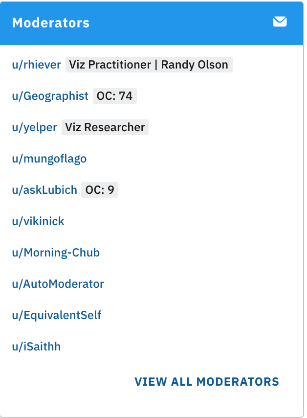
Moderation in the community follows a distributed social moderation [1,5]. In Figure 12 some of the moderators are visualization practitioners and researchers.
The rules of the community are listed clearly in the home page Figure 13. Some rules are relevant to authors, others were for commenters. The rules highlighted in red exemplify a healthy behavior in the community. My favorite rule is #8 “Posts regarding American politics …are permissible on Thursdays”. These topics tend to be the most toxic “and sometimes boring if you’re not from here”. This limit in the type of topics allows for more diverse and general topics to take place.
Another interesting rule relevant to commenting is that short comments and low effort replies are automatically removed. This allows for richer and more deep discussions to happen.
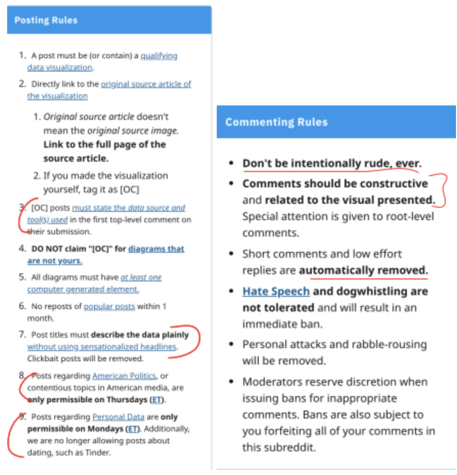
Figure 13: Posting and commenting rules from r/DataisBeautiful. Annotated ones are the one will be discussed in the health of the community.
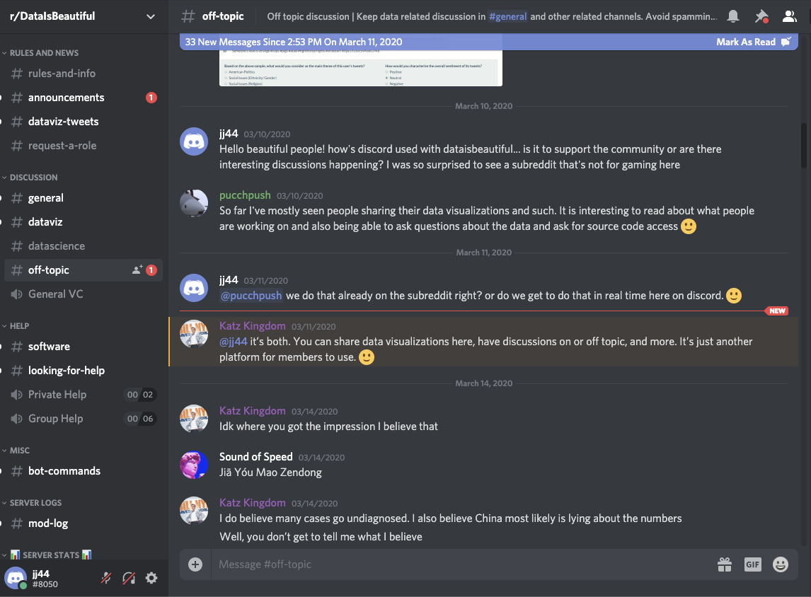
Also, moderators created another space in which off topic discussions and complaints happen in their very own Discrod community. Figure 14
Moderation style as I observed is in moderation. As long as the general rules are followed, users are free to share their own tools even if they are not publicly available (while open source is recommended) moderators are allowing for more flexible contributions from the community. Figure 15

Avoiding Echo Chambers
The idea of r/dataisbeautiful is to list posts and stories around topics instead of emphasizing on the relationship between community members. In such community, member are introduced to all sort of contexts and ideologies which open up a huge opportunity to engage in conversations with the others, which in a result helps avoid echo chambers. [8]
One feature that encourages such a health behavior is the link right bellow the comment authoring sections that says “View discussions in 12 other communities. Figure 16.
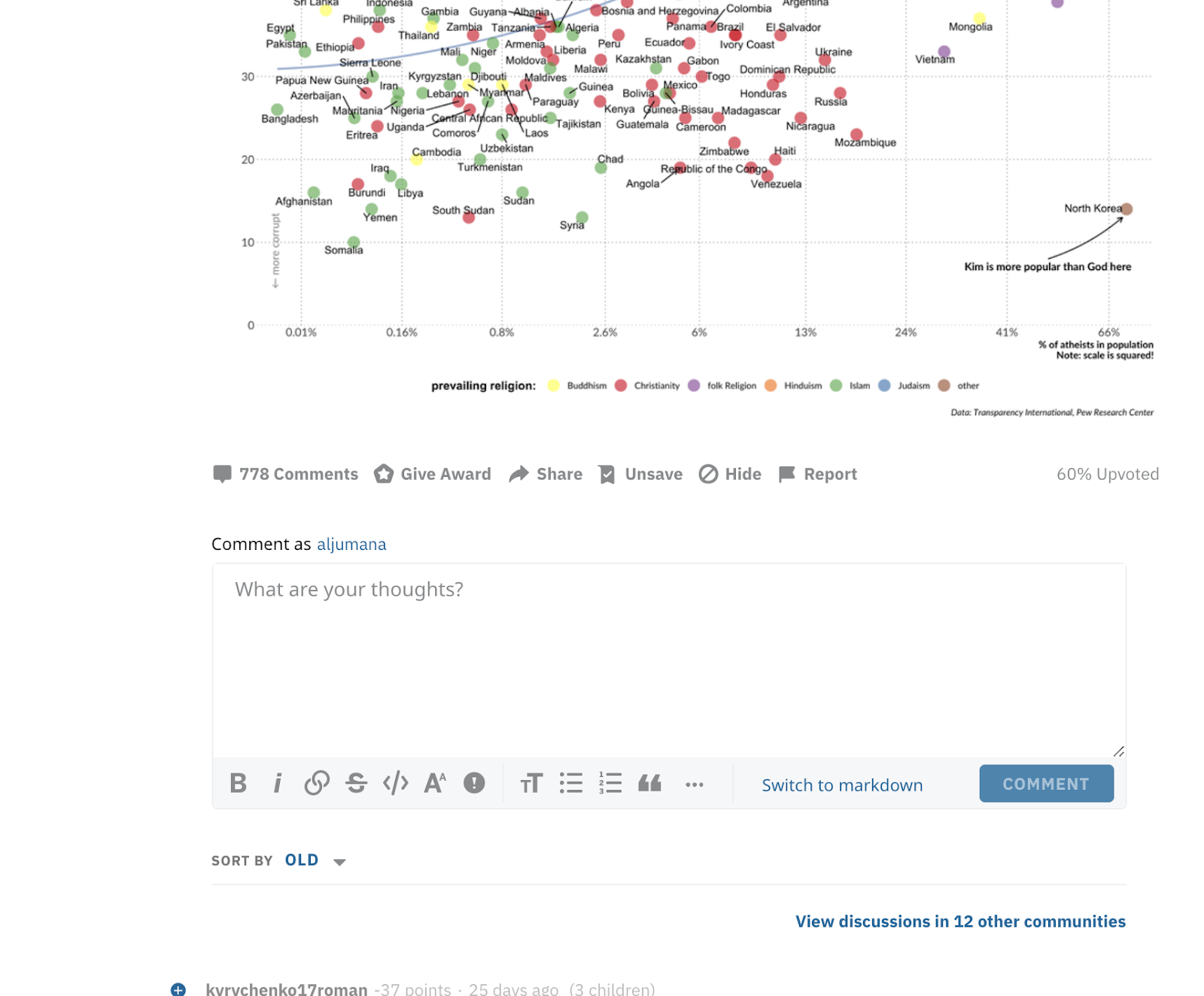
The same data story appears on top and members are presented with the different discussions that happened around the same data story. Each community has a different point of view and different priorities in their conversations. Figure 17

Conclusion: Is this community healthy for all?
When I asked around experts and read online, I found that some people are complaining that r/dataIsBeautiful is becoming more analytical and ugly! As we see in the quotes bellow the commenter recommends r/dataIsUgly cause it’s more realistic and better for learning! I looked into the online discourse around r/dataisbeautiful and found that many people do prefer dataisugly over r/dataisbeautiful. I find this is confusing since most discussions and interactions happen in the r/dataIsBeautiful not Ugly!
Here are some quotes from quora [9] regarding dataisUgly vs dataisBeautiful
I think it’s a nice sentiment, but definitely dominated by amateurs and optimistic college students. I’m sure there’s a few experts on there making beautiful visualizations that tell a compelling story, but most of it is pretty graphics on top of bad analysis and further mutated by ham-fisted science journalism.
Data Is Ugly seems like a much more realistic representation of my experiences.
—
I’m not a practicing data scientist (just a vanilla scientist who makes plenty of graphs and other visualizations for a living), but I’m pretty torn about /r/dataisbeautiful. I want to like the subreddit, but, while the data collected and presented could be interesting, the visualizations are almost uniformly terrible.
Figure: Both comments came from data scientists
While the number of posts and participants are enough to indicate the popularity of dataisbeautiful over dataisugly. Also the rules are more appealing in the first one. dataisugly doesn’t require that the posts are original contribution. However, dataisbeautiful highly recommends that.
To answer the questions of who this community is healthy for, I would say it’s healthy for everyone. It’s just “boring” and “frustrating” for data scientists since what they care about is the analysis side. While analytics is a very important part of the visualization, focusing on having a beautiful chart and strict analysis makes it an intimidating community that could be less inviting to the diverse set of users it has. And as I have demonstrated above, the experts and pro in stats help the vis savvy and vice versa and that’s a healthy dynamic.
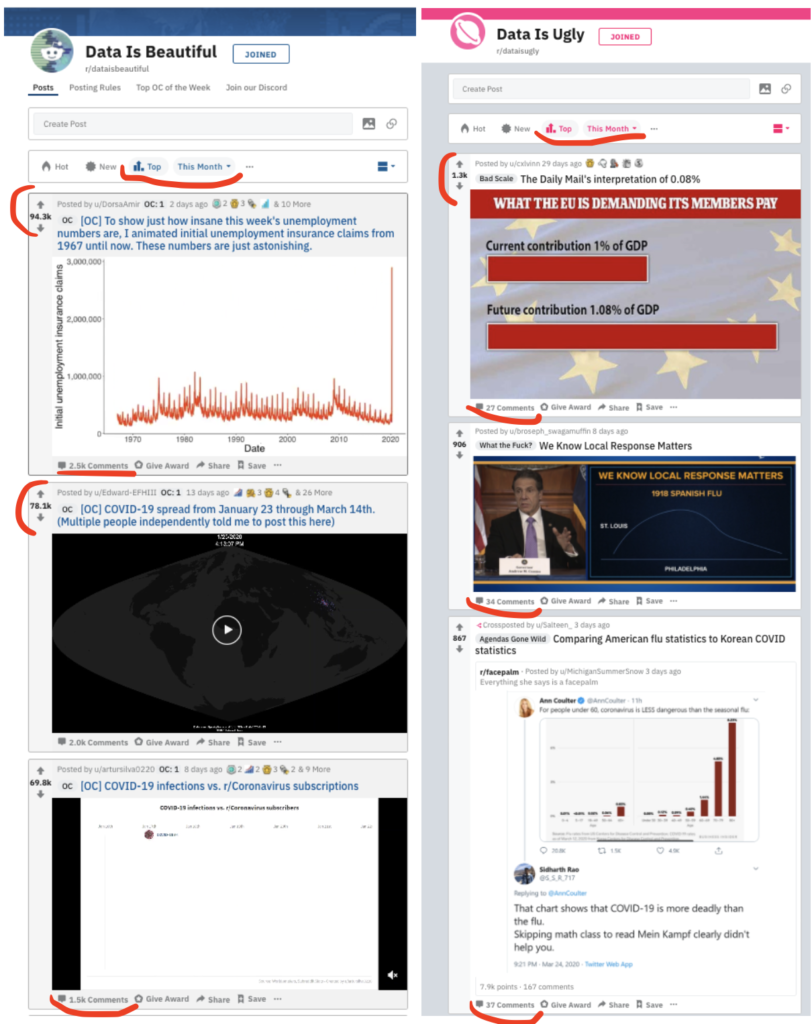
I want to conclude with Figure 17, comparing the top results this month between the two communities. Clearly starting with an ugly chart is not a healthy way to start a conversation as indicated in the number of interactions. It’s ok to feel that your data is beautiful and have someone say it’s ugly and here is why!
References:
[6] Kimberly A. Neuendorf. 2016. The Content Analysis Guidebook. SAGE.
1 reply on “How Data Visualization is Discussed Online in a Healthy Community”
I love that you considered a range of data visualization communities before settling on DataisBeautiful. Thank you also for being so clear about your criteria for what makes a healthy community. I found the observation about moderation in moderation to be the most helpful and engaging of the discussions. I would love to see you dig a bit more into the idea of who the current community is most healthy for – the contrast with DataIsUgly is helpful, but it makes me wonder more broadly about who the community attracts and fails to attract and how that might influence community dynamics.