Categories
Uncategorized

Design Document| vizdat!: The visual online discussion layer for social media

reddit before using vizdat extension
reddit after using vizdat extension

Summary

So much discussion is happening these days that is backed up with data visualization (charts or graphs), but the problem is, misinformation and trust issues could arise due to the fact that these visualizations are not fully understood, or can’t be reproduced to more accurate versions unless the author of the chart decides to do so.  In this work, I explored simple and lightweight workflows to democratize the process of discussing data on the web for social and knowledge seeking purposes. I looked into existing tools that empower users to visualize data on the web but they are disconnected from where the discussion is happening (i.e. social media). I have built “vizdat!” a solution that is a layer over online communities that discusses data visualizations (charts) to allow community members to visualize and reproduce charts in-situ to improve the commenting experience and enrich online discussion around charts.

Background and Motivation

Whenever there is data shared on the web as a chart and there is a comments section, the discussion is often only in text [e.g The Upshot, The Economist, Reddit, etc.]  Imagine you are on twitter, a blog or reddit. You saw a chart (visualization) but felt something was wrong or wanted to discuss or add something to that chart. The way the web currently works, is that a person shares a chart online and in the comments people are only allowed to reply with text!

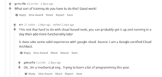
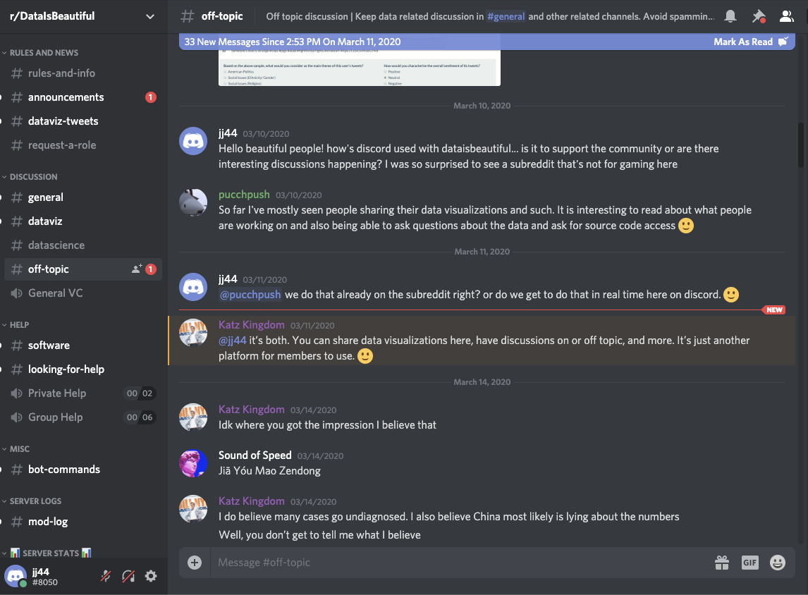
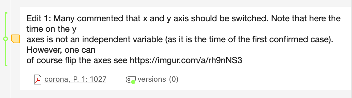
I asked one of r/dataisbeautiful moderators about how to share charts in comments, and his answer was the following

Moderator’s reply when i asked him about posting charts in the comments section on r/dataisbeautiful.

There has to be a better way to discuss charts online! What if we make the comments section more visual and interactive . What if we enable users to comment with charts, not just text, to extend the discussion around the data story even further. That’s where vizdat! comes in. vizdat! is a website + a chrome extension that changes the UX of online communities to enable users to discuss interactive charts with interactive charts, instead of just text.

Design Research

The idea started when I started talking to social media influencers who like to share media in general with their audience. I started exploring the question:  How might we enhance the commenting experience online?

This question felt too broad so I narrowed down the commenting experience on media that is in the form of charts and graphs. So I focused instead on: How might we facilitate online discussion around charts? In order to narrow down the design scope even further I looked into quantified self communities, data journalism outlets, twitter, facebook and reddit. Discussion around charts is everywhere yet, text comments are the norm! so: How might we make visual comments anywhere, anytime on the web? That is my main research question. 

For this design document, I narrowed the audience down to one interesting and safe community, which is r/dataisbeautiful on reddit. I have improved my prototype around the technical and social constraints in that community. How might we improve discussion around data on r/dataisbeautiful? In order to answer that question for this project I have performed the following: 

→ digital ethnography

→ contextual analysis

→ need finding

→ built vizdat based on the identified needs

→ posted on reddit, but not so much traffic to my stories, and some of them got removed. (stricts moderation)

→ reached out to mods, I wasn’t allowed a recruitment message

→ created a subreddit that simulates r/dataisbeautiful with all it’s restrictions and rules (e.g. no posts with text only links and images, original post must be marked with OC and so on).

→ usability tested and observed how users react on that simulated community 

Interview

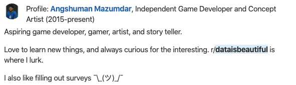
I interviewed a Quantified Self speaker who is also a social media influencer. I was curious about how he shares his data with his huge audience. For example, he is a runner and he uses Strava to share his runs as shown in the image below. He does have a huge following on the app but he only gets likes as opposed to comments. 


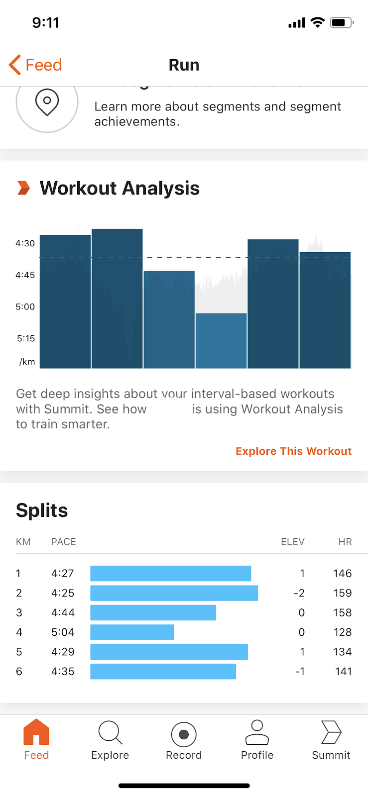
Strava: through this app the runner shares his stats and runs.Although the app allows for commenting,  he gets likes only, no comments.

He tried sharing the same charts on facebook and reddit and he rarely got any meta comments or any useful comments. When he spoke at QS he shared his data with like minded people and according to his words he loved the comments and insights he got from people who were interested in his data. In my interview with him he made the following comment:

I would love it if I could have people like me look at my data and I look at their data whether it’s a log data from running experience or so and then comment on them a meaningful comment that would be nice but the current apps don’t allow this the only thing that I get from sharing my log is people asking me about the best running shoes or how do you get yourself to run and stuff like that which is not relevant to the data I’m sharing and that’s two to the app limits in my opinion

I followed up with him by asking him what he meant by a meaningful comment and his reply was:

Meaningful comments to me would be something that is:

  • investigating the WHY or pointing to insights from the data or story.
  • asking a question/comment that would make me think or curious to figure out. (such as this follow-up Q) 
  • A comment suggesting different/new efficient methodologies.

The points in bold are features I have considered when building my solution “vzdat!”.

Need Finding

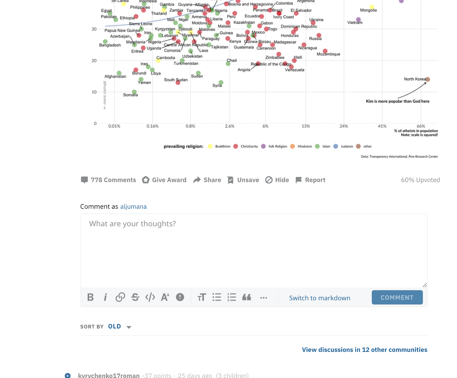
In addition to talking to prospect users, I looked into different communities where data is discussed. I first looked at news outlets such as The Upshot and The Economist and social media websites such as twitter. My goal was  to identify recurring patterns and practices around discussing charts as shown in the snapshot below.

Charts discussed on twitter and the Upshot annotated by comment type

It was clear that there were general patterns. When data is discussed over the web in a lightweight format (e.g tweets, comments, blogs replies etc) users tend to use a lot of numbers. The following are the main tasks ordered:

  • The discussion involved replies and comments on the visualization wanting to know how to reproduce (asking for data and code)
  • Replies had users pointing at numbers in the visualization or actually screenshotting and replying with the image with their comments.
  • Design Critique on the type of visualization used or other aspects of design like color and text.
  • Comments involved teachers and members of the community expressed their intent to use those visualizations to educate their community about the domain in which the story of vis is about. (purpose of narration) guided tour (videos to show) gapminder Keyframes in creating animated interactive visualization (narrated visualization) (northwestern) (

Domain experts who started a vis story, reply to people’s questions about the domain with more visualizations.

Scope

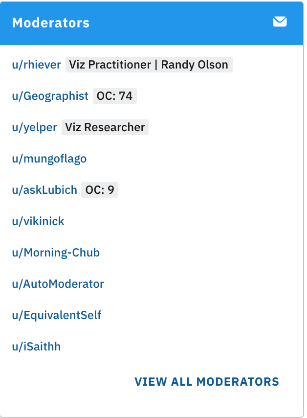
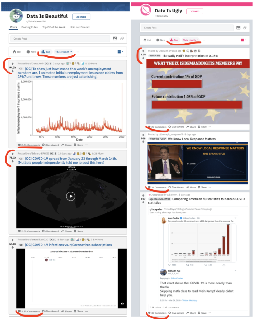
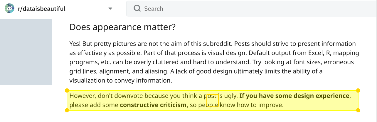
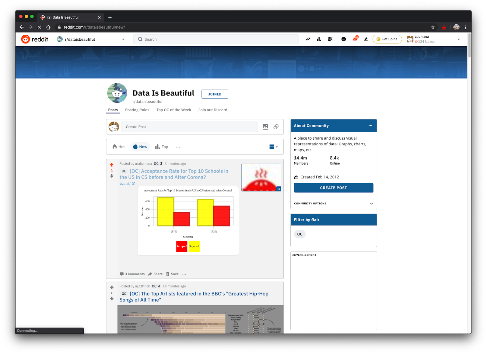
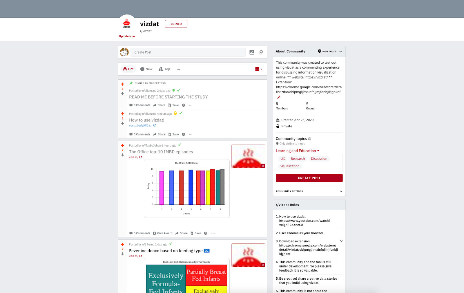
For the sake of this milestone and class, I narrowed down the scope of my audience to a safe community on reddit called r/dataisbeautiful. According to their definition of the community: it’s “a place to share and discuss visual representation of data: Graphis, charts, maps, etc.”  The community lists many posts that are a composition of a visualization with a title and a description by the author of how it was made and his or her design rationale. In addition to that, users can comment on the main story and reply to each other. The community is for professionals and amateurs, experts and novices. I looked where the action is and it’s in the community itself in addition to “discord” (the chat community associated with it). The posting rules of this community are simple. Anyone can post as long as their post contains a data visualization, mention the source data and indicate if it’s their original contribution or not.


Home page of r/DataisBeautiful. Each post is a data story and community members get to participate and reply to that story and to each other.

Qualitative Work

In order to better understand and identify the  needs of r/dataisbeautiful I followed a mixed approach. I participated as a member and as an observer in r/dataisbeautiful. I used content analysis [6] and participation observation [3]. I wanted to ground my work so I looked into 7 reddit posts with more than 500 comments, I coded the comments with open codes and iterated 2 times until I felt I have a saturated list. The first pass helped me identify general trends in the community. The second pass was to saturate and confirm my coding. 

Digital Ethnography and Contextual Inquiry 

I spent almost 4 months in r/dataisbeautiful as an active member. I looked into how users comment on each other and on the main post. What I find very fruitful about that community is the nature of comments.


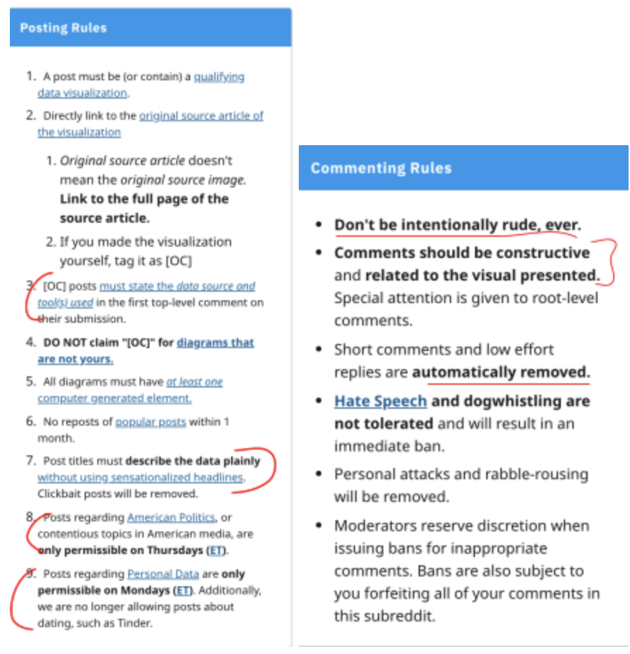
Rules for posting on r/dataisbeautiful

Most comments are meta talking about the visualization or chart. As we will see in the codes section, a lot of these comments were critiques, either the data, chart type, analysis or aesthetics. There was also a tendency to reproduce work and share it either as a new post or in the comments. Some users talk about aspects of the visualization configuration.Others address data issues that were clearly manifested by the data visualization. (users see triggering component  in the vis, look at the dataset as a result then comment) 


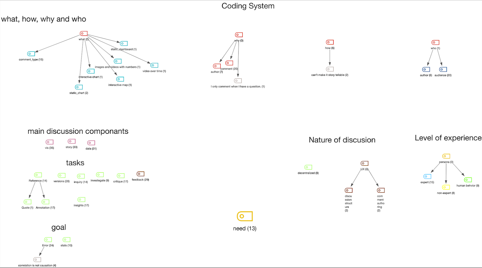
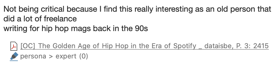
Coding system used to analyze the comments

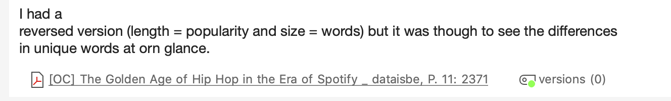
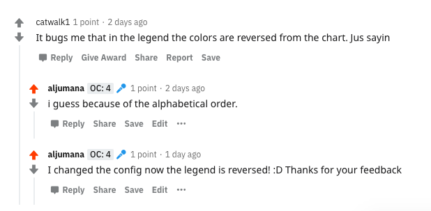
While coding the data I looked into intentions of users, why: critique, suggest, inquire etc. I also looked at how and what users comment, while reddit is strict regarding the comments and only allows text. Some users post links either to their improved visualization or their suggestions to the main author. Finally I also looked at who the audience is, the author and the commenters. I identified some personas in which I can design for which includes learners and experts. The following snippets are screenshots of comments on different posts. From these comments I was inspired with the functionalities that I added to vizdat.

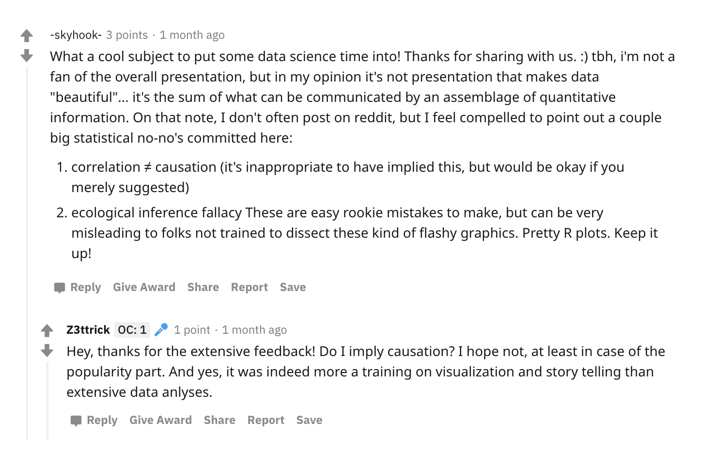
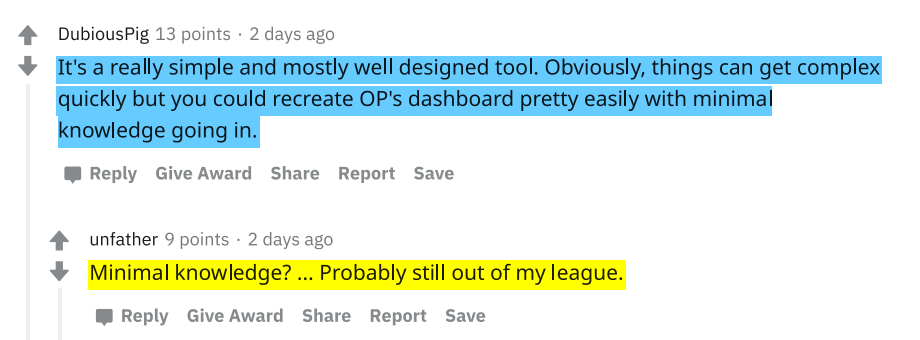
The following quotes are comments that were encoded and indicates some meta discussion.

That comment inspired a feature on vizdat to allow users to manipulate the scale.
On vizdat, the users have the ability to choose the x and y axis and switch between them.
reproduced version of the vis that could be easily done on vizdat.
On vizdat users can change the type of chart and data type.

vizdat!

Vizdat was built based on the user needs identified before. It offers an ecosystem for creating commenting with charts on the web. Building an extension was ideal since the idea is to modify web pages to allow charts to be rendered and add new elements to the comments sections.

A post using vizdat on r/dataisbeautiful

Function list

  • render visualization on page when links of vis are detected
  • Allow users to reply with viz organically from the comments section
    • Reply with viz: loads the vis associated with that post to blend in with the Reddit UX
  • Edit viz and reproduce vis in situ in the comments section (seamlessly)
  • Have the data and vis in one resource if user clicks on the rendered interactive vis or links
  • Edits include: change type, scale , colors, story , data type
vizdat in action

Challenges 

Technical challenges

The first challenge I faced to address the needs on reddit, is a technical challenge.  R/dataisbeautiful only allows for text and images post, no code or markup could be embedded. Comments also are text only. Reddit users React which is a front end framework and they tend to have a weird behavior in layering pages. Also, the class and id names for their elements are random and the names can’t be tracked or selected. All of that made it so challenging to manipulate the DOM and actually have the extension render charts and buttons to facilitate commenting with charts.


Asking the discord community about the technical challenges.

However, with continuous iteration and testing I was able to build a tool that fits in well with the reddit community (vizdat is generic for all websites with discussions, but i had to customize the extension for reddit at some part of the UX).

Social and Moderation Challenges

Now that the tool worked, I tested it out in r/dataisbeautiful. The community is well known to be passionate about data visualization. I posted 3 posts and received very few interactions and I wasn’t able to put up instructions to use the tool, so the comments I ended up receiving weren’t using the tool. 


Example of the comment I have received which i have incorporated as a feature in the tool (co-design)

I reached out to the moderators for help but I was told advertising tools in the community is not recommended and could lead to posts being removed. The moderation on r/dataisbeautiful was challenging when it comes to research, specially that my tool is still in its testing phase and asking users to adopt a new tool requires more control over the type of posts (pinned post with instructions for example.)

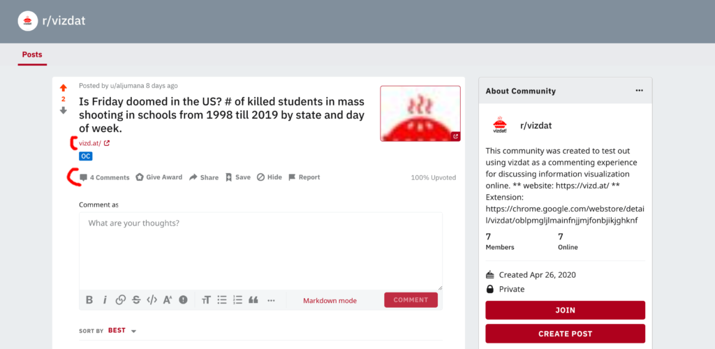
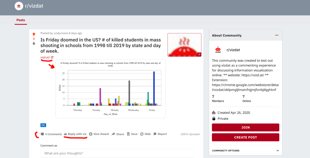
In order to overcome that adoption and moderation challenges, I created a subreddit r/vizdat that simulates the rules and constraints of r/dataisbeautiful. The only difference is that I am the moderator and can easily mandate rules and keep posts. The goal of that subreddit is to usability test my tool. 

r/vizdat: a subreddit that simulates r/dataisbeautiful

vizdat co-design and usability testing sessions

I tested the tool with 10 users, 2 in r/dataisbeautiful and 8 in the simulated community r/vizdat . Each user study session lasted between 60 to 90 mins. The sessions were on zoom and I asked users to share their screens, follow the instructions provided in the community and think aloud. Other than co-designing and usability issues, I was interested in the thinking process that users go through when looking at other charts and what kind of comments are enabled using this tool.

Users of the study were a diverse set of participants. 4 were data experts in their field (2 medicine, 1 linguistics, 1 clinical dietitian). They use analysis tools such as SPSS and sometimes Excel to manipulate their data. They create visualization using these tools and share them in their reports and papers. The other 6 participants were computer scientists who are comfortable with programming and technology but rarely visualize.

a post generated by users

Results and Discussion

To my surprise domain experts did a better job generating charts with good stories than those who are computer scientists and tech savvies. It was easier for them to frame a narrative and then build a visualization. The limitation could be that the CS sample didn’t include visualization in their workflows and had difficulty story telling. When building vizdat I made sure it was easy enough for anyone to use. The idea is to have a visualization as a lightweight easy step in online discussion. This first pass of user study is more to tackle the usability issues. Some of the main issues were:

1- Some users never used Reddit in their entire life, this was one of the biggest issues. Posting on reddit is not intuitive especially if the subreddit had restrictions in commenting (only links and images allowed). I had to show them to reduce the learning curve.

2- Users who chose to visualize their own data shared their data cleaning process. While this is out of scope it was useful to see how these users were also struggling with their own current flows. Vizdat gives users the ability to do some data manipulation such as changing data types and so on.

3- Some users lack knowledge in info vis (e.g. representing nominal vs quantitative data) the tool was helpful for them in which it provides a cue of the data type. However, they need more than that, for example a help button and a tutorial to educate them in the basics of info vis.

4- Some users asked about the provenance of the data, the tool allows users to fork visualizations and data in order to create their own, while the forking feature was clear, users wanted to see the lineage of users before them.

5- the first batch of users were so helpful in framing my instructions. One user suggested having in the instructions two images one showing the community without vizdat and the other with the extension. Another one found it really useful to have the video with the instructions as opposed to reading text.

7- Most users like the feature in which vizdat automatically creates a starting chart based on the data they have uploaded. However, one user mentioned: “the auto viz thing primed me, i feel it affected my judgment to go with your suggestions.” That was when she created a post. It was a different case when she commented since it was clear what she actually wants to do.

8- Usability issues such as were to click to close a window and how to share were addressed in the final version shared in chrome store.

Future work

  • I’m planning to follow through with the suggestion from the r/dataisbeautiful moderator. While he recommended not spamming the community he suggested reaching out directly to users in the community and asking them to post. That way I will make sure I’m recruiting a more relevant sample for my study.
  • To scale and have a better sense and observations, I’m planning on starting a visualization GAME in r/dataisbeautiful (if the mods allow me). The game idea is to have a main post and as users to comment with another chart using the data but telling a different story. The last person in the game who successfully reproduces an interesting chart is the winner.
  • On r/vizdat the simulated community. One user posted something NSFW see screenshot below. The way twitter works is that it doesn’t render any link or thumbnail if the post is marked as NSFW. However, vizdat renders any visualization link created with the tool. As a moderator and a tool builder, in my future work I will think about how to make sure a community is a  safe space even with the tool? One idea is to detect the word NSFW in the web document and not render.
Reddit takes care for NSFW content and vizdat needs to do the same

Acknowledgment

I would like to thank Ethan for his continuous support and great advice during and before the class. I would like to thank Nathan Mathias for showing me the way on Reddit and the moderators. I would also like to thank Anna for her support and patience in replying to my questions. Finally, if it wasn’t for my advisor David Karger’s direction and his trust in my ideas, I wouldn’t have had the freedom to explore the “what-ifs” in research and online discussion.

Appendix

vizd.at

chrome plug-in

example on r/dataisbeautiful

r/vizdat


Categories
Uncategorized

Proposal: Fixing Online Discussion around Data Vis

Summary

So much discussion is happening these days that is backed up with data visualization, but the problem is, misinformation and trust issues could arise due to the fact that these visualizations are not fully understood, or can’t be reproduced to more accurate versions unless the author of the vis decides to do so.  In this work, I want to explore simple and lightweight workflows to democratize the process of discussing data on the web for social and knowledge seeking purposes. I looked into existing tools that empower users to visualize data on the web but they are disconnected from where the discussion is happening (i.e. social media). I’m proposing building a solution that is a layer over online communities that discusses data visualizations to allow community members to visualize and reproduce visualizations in-situ to improve the commenting experience and enrich online discussion around data stories .

The community

Any community that has discussion around data visualizations with the goal to effectively convey information. For the sake of this assignment, I’m focusing on blogs or reddit. 

Problems to address

Centralized Discussion

Sometimes users want to take the vis somewhere else to discuss it with another type of community. Also, sometimes users want to reproduce a different version and share it to their own niche. Can we make that discussion more decentralized?

Effective utilization of the Collective effort to Improve Data stories

Members of these communities are continuously fact checking the conclusions and data used, leading them to a healthy explorative behavior in which they probe, investigate and inquire about the conclusions, the data and the visualization. How do we capture that provenance and lineage for others to leverage on? Reading the visualization story alone is not as rich and useful as reading the discussion about it. That collective knowledge is what makes these data stories more appealing and informative.

Technical challenges in reproducing work and science

Many members in these communities expressed in their comments that they would like to build a visualization similar to what the author shared. There were many questions about how, and what in regards to the process. While this could be a sign of a healthy community that wants to learn. While the instructions and the language are encouraging, the affordances are not yet inviting to novice users. And that is a problem I want to be working on in my project for this class.

Proposed Solution

For building the user experience of the tool I will use a simple template-based approach for authoring the visualizations, and a library in the background to build the visualization using D3 and D3Plus. The tool consists of two main components: Web App and a Chrome Extension for authoring the visualization. The most important part  in this project is the discussion and commenting experience, how can we include interactive visualizations in the comments that are reproduced with better data and design decisions. My hope is to create a community that discusses data visualization with data visualization not just with text.

Categories
Uncategorized

How Data Visualization is Discussed Online in a Healthy Community

Background

Before deciding on r/DataisBeautiful I looked into different communities where data is discussed. I first looked at news outlets such as The Upshot and The Economist and others. But from my initial observations about the discussions, while a number of the comments talked about the visualization, mostly comments went off on a tangent. Also most of these news outlets disable comments or allow them for a limited amount of time. And when they do, they are heavily moderated and toxic to the population who are not part of the group of moderations. Clearly, not a healthy community!

Given that type of moderation and selective harassment that get looked over in those news outlets, I felt it wasn’t a good choice for a “healthy” community. Mainly, what I care about is how people civilly discuss data visualizations and how they interact with them and with each other in a  more focused and healthy community. 

I found three communities that I had to choose from. I filtered them based on where most of the discussion happens and how saturated is the discussion in that community. The first one is VisGuides Figure 1. The idea of this forum is great in which visualization is discussed and criticized to produce guidelines that other members suggest to each other . However, not so much discussion happens there. When sorting the posts by the top ones, the highest one got 3 replies. That is not enough to explore the health and discourse of this community. 


Figure1: VisGuides is a democratic discussion forum about visualization guidelines. Not so much discussion happens there. When sorting the posts by top, the highest one got 3 replies.

The second community that I considered is vis.social Figure 2, a twitter like community for data analytics and visualization. The problem with this community is members were deviating away from the main goal of the platform. Users are posting just like they are doing on twitter except for a few accounts which were true to the nature of the community. Due to the insufficient data discussions that happened there. I looked into what I perceive as the best community so far to discuss data visualization online. In the few sections I will show why!

Figure2: vis.social is supposed to be a social network for shared data and visualization. However, it is becoming more like twitter in which users are just going off topic and not talking about visualization or data.

r/DataisBeautiful

DataIsBeautiful is for visualizations that effectively convey information Figure 3. According to their definition of the community: it’s “a place to share and discuss visual representation of data: Graphis, charts, maps, etc.”  The community lists many posts that are a composition of a visualization with a title and a description by the author of how it was made and his or her design rationale. In addition to that, users can comment on the main story and reply to each other. The community is for professionals and amateurs, experts and novices. I looked where the action is and it’s in the community itself in addition to “discord” (the chat community associates with it). 


Figure 3: Home page of r/DataisBeautiful. Each post is a data story and community members get to participate and reply to that story and to each others.

The posting rules of this community are simple. Anyone can post as long as their post contains a data visualization, mention the source data and indicate if it’s their original contribution or not. As for commenting rules the norm is to be polite and avoid any hate speeches. In general, the social norms are standards and rules the are known by the community, enforced socially without legal or law enforcements. It’s how everyone is expected to behave in a community [2, 3]. Some of the healthy rules I will be describing in more detail in the following sections.

Methodology

In order to define the criteria I’m using to determine the health of the community I followed a mixed approach. I participated as a member and as an observer in r/dataisbeautiful.  I used content analysis [6] and participation observation [3]. I wanted to ground my work so I coded the comments that happened on reddit. The first pass helped me identify the general healthy criteria in the community. My second pass was to saturate and confirm my codings. 

Community Healthy Criteria

The main components I was looking at are: how sharing a visualization story triggers discussion, what kind of discussion and community energy from that.

Based on my qualitative analysis this is a list of the criteria of a healthy community that discussed data visualization online:

  • A community must have a diverse set of Participants with different perspectives and goals
  • A community must be a safe environment for learning and growing
  • Community members should have the tendency to reproduce work and science
  • Community member should participate in constructive criticism and collective effort to add knowledge
  • Community discussions should ad more information to the story (insight, data,)
  • Community moderation should be in Moderation

In the following section I will talk about each criteria and give examples from the community of choice r/dataisbeautiful

Diverse set of Participants

The type of users in this community range from experts to novices and amateurs to professionals. For example an expert in hip-hop and a professional writer in the field clearly explained his position and contributed to the discussion from his point of view Figure 4, replying to an audience that is mostly amateur in hiphop but more expert in data analysis and visualization

Figure 4: hip-hop and a professional writer commenting on a vis story about the history of hiphop

While some community members are experts in stats, some authors of the visualizations lack stats knowledge, they share a beautiful data story and ask for feedback on both the esthetics and the analysis. This diverse set of community members made it safe to clearly indicate what an author lacks and what kind of discussion or help they look for in relation to the story they have shared. Figure 5 & 6.

Figure 5: The author (the the mic icon) is trying to improve his visualization and story-telling skills and defended his work in a healthy way while expressing his main goal of sharing the story.
Figure 6: Here is a conversation showing the level of expertises. I consider this health, not condescending since both parties were freely expressing their opinion without any shame.

Given the nature of the community and the diverse experience and professional levels, a natural healthy behavior emerged in which I have observed in the discussion indicating “wanting to learn”, “how did you do this” ,”what software are you using etc.”. And more importantly, those who asked these questions have received answers. Which leads me to the second healthy point in this community.

Safe space to Learn

While some users learn from reading “lurking” comments, the experience is more rewarding when the original author of the story is part of the discussion and defending their decisions. Which is something we don’t see in other data story communities such as new papers, in which the reporter, the data journalist and the editor end their job when the story is published.

When looking at the discourse outside r/dataIsBeautiful Figure 7 this is the perception of the community in terms of learning. [10]

Figure7: An evidence from an online community on how r/dataisbeautiful is useful

Looking at reddit bellow Figure 8 are quotes collected from the discussion about a COVID dashboard. The first comment is a user asking about the tool that made the chart, the other wants to understand how much training is involved to build such a tool and so on.

Figure 8: Comments collected from r/dataisbeautiful

The following examples Figure 9 don’t just show that users want to learn through these discussions, but more importantly indicate what’s healthy, which is getting the proper reply and help these users are looking for without being shamed or ridiculed. Just like any safe learning environment.

Figure 9: Replies by more advanced users to novice questions.

Finally, one interesting pattern is what manifested in this member’s comment Figure 10. He was observing an intense discussion about statistics and he expressed how these conversations are immensely useful in complementing the knowledge he received from his formal education.

Figure 10: Happy he was able to understand!

Collective effort to Improve (Meta Commentary)

In this community I have observed interesting conversational interactions between authors and audience and among the audience themselves. The audience comment with suggestions, inquiries and feedback (on the visualization or the analysis) in which authors act on and sometimes share newer versions of their stories based on these comments. In addition, members of this community are continuously factchecking the conclusions and data used, leading them to a healthy explorative behavior in which they probe, investigate and inquire about the conclusions, the data and the visualization.

Reading the visualization story alone is not as rich and useful as reading the discussion about it. That collective knowledge is what makes these data stories more appealing and informative.

Tendency to reproduce work and science

Many members expressed in their comments that they would like to build a visualization similar to what the author shared. There were many questions about how, and what in regards to the process. While this could be a sign of a healthy community that wants to learn. It’s also a better sign that the design of the community itself is encouraging that as shown in figure 11.While the instructions and the language are encouraging the affordances are not yet inviting to novice users. And that is a problem I want to be working on in my project for this class.

Figure 11: Right bellow every story there are instructions, one of them is regarding how to remix this visual.

Moderation in Moderation

Moderation in  the community follows a distributed social moderation [1,5]. In Figure 12 some of the moderators are visualization practitioners and researchers. 

Figure12: Type of Moderators in the community. Some are experts and researchers in the field.

The rules of the community are listed clearly in the home page Figure 13. Some rules are relevant to authors, others were for commenters. The rules highlighted in red exemplify a healthy behavior in the community. My favorite rule is #8 “Posts regarding American politics …are permissible on Thursdays”. These topics tend to be the most toxic “and sometimes boring if you’re not from here”. This limit in the type of topics allows for more diverse and general topics to take place.

Another interesting rule relevant to commenting is that short comments and low effort replies are automatically removed. This allows for richer and more deep discussions to happen.


Figure 13:  Posting and commenting rules from r/DataisBeautiful. Annotated ones are the one will be discussed in the health of the community.

Also, moderators created another space in which off topic discussions and complaints happen in their very own Discrod community. Figure 14

Figure14: Discord chat for admin and off topic chats. Also visualizations and feedbacks are given here in a more informal and real time way.

Moderation style as I observed is in moderation. As long as the general rules are followed, users are free to share their own tools even if they are not publicly available (while open source is recommended) moderators are allowing for more flexible contributions from the community. Figure 15

Figure 15: Moderation in moderating creating a space in which this user was able to share his tool and advertise it, which some felt is unfair. However, the author consulted the moderation and followed the rule which is fair enough!

Avoiding Echo Chambers

The idea of r/dataisbeautiful is to list posts and stories around topics instead of emphasizing on the relationship between community members. In such community, member are introduced to all sort of contexts and ideologies which open up a huge opportunity to engage in conversations with the others, which in a result helps avoid echo chambers. [8]

One feature that encourages such a health behavior is the link right bellow the comment authoring sections that says “View discussions in 12 other communities. Figure 16.

Figure 16: bellow the comment authoring sections that says “View discussions in 12 other communities.

The same data story appears on top and members are presented with the different discussions that happened around the same data story. Each community has a different point of view and different priorities in their conversations. Figure 17

Figure 17: 12 other communities that discussed the data story but are not necessarily about data visualization

Conclusion: Is this community healthy for all?

When I asked around experts and read online, I found that some people are complaining that r/dataIsBeautiful is becoming more analytical and ugly! As we see in the quotes bellow the commenter recommends r/dataIsUgly cause it’s more realistic and better for learning! I looked into the online discourse around r/dataisbeautiful and found that many people do prefer dataisugly over r/dataisbeautiful. I find this is confusing since most discussions and interactions happen in the r/dataIsBeautiful not Ugly!

Here are some quotes from quora [9] regarding dataisUgly vs dataisBeautiful

I think it’s a nice sentiment, but definitely dominated by amateurs and optimistic college students. I’m sure there’s a few experts on there making beautiful visualizations that tell a compelling story, but most of it is pretty graphics on top of bad analysis and further mutated by ham-fisted science journalism. 

Data Is Ugly seems like a much more realistic representation of my experiences.

I’m not a practicing data scientist (just a vanilla scientist who makes plenty of graphs and other visualizations for a living), but I’m pretty torn about /r/dataisbeautiful. I want to like the subreddit, but, while the data collected and presented could be interesting, the visualizations are almost uniformly terrible.

Figure: Both comments came from data scientists

While the number of posts and participants are enough to indicate the popularity of dataisbeautiful over dataisugly. Also the rules are more appealing in the first one. dataisugly doesn’t require that the posts are original contribution. However, dataisbeautiful highly recommends that.

To answer the questions of who this community is healthy for, I would say it’s healthy for everyone. It’s just “boring” and “frustrating” for data scientists since what they care about is the analysis side. While analytics is a very important part of the visualization, focusing on having a beautiful chart and strict analysis makes it an intimidating community that could be less inviting to the diverse set of users it has. And as I have demonstrated above, the experts and pro in stats help the vis savvy and vice versa and that’s a healthy dynamic.

I want to conclude with Figure 17, comparing the top results this month between the two communities. Clearly starting with an ugly chart is not a healthy way to start a conversation as indicated in the number of interactions. It’s ok to feel that your data is beautiful and have someone say it’s ugly and here is why!

Figure 17: r/dataisbeautiful vs r/dataisugly

References:

[1] Eshwar Chandrasekharan, Mattia Samory, Shagun Jhaver, Hunter Charvat, Amy Bruckman, Cliff Lampe, Jacob Eisenstein, and Eric Gilbert. 2018. The Internet’s Hidden Rules: An Empirical Study of Reddit Norm Violations at Micro, Meso, and Macro Scales. Proc. ACM Hum.-Comput. Interact. 2, CSCW (November 2018), 32:1–32:25. DOI:https://doi.org/10.1145/3274301

[2] Robert B. Cialdini and Melanie R. Trost. 1998. Social influence: Social norms, conformity and compliance. Retrieved March 27, 2020 from https://www.semanticscholar.org/paper/Social-influence%3A-Social-norms%2C-conformity-and-Cialdini-Trost/bc4d09459f298901ebb6894652319c9be3c3b8b2

[3] Danny L. Jorgensen. 2015. Participant Observation. In Emerging Trends in the Social and Behavioral Sciences. American Cancer Society, 1–15. DOI:https://doi.org/10.1002/9781118900772.etrds0247

[4] Sophie Legros and Beniamino Cislaghi. 2019. Mapping the Social-Norms Literature: An Overview of Reviews. Perspectives on psychological science : a journal of the Association for Psychological Science (2019). DOI:https://doi.org/10.1177/1745691619866455

[5] Lena Mamykina, Bella Manoim, Manas Mittal, George Hripcsak, and Björn Hartmann. 2011. Design lessons from the fastest q&a site in the west. In Proceedings of the SIGCHI Conference on Human Factors in Computing Systems (CHI ’11), Association for Computing Machinery, Vancouver, BC, Canada, 2857–2866. DOI:https://doi.org/10.1145/1978942.1979366

[6] Kimberly A. Neuendorf. 2016. The Content Analysis Guidebook. SAGE.

[7] Michael Schudson. 2008. Six or seven things news can do for democracy. In Why democracies need an unlovable press, Michael Schudson (ed.). Polity, Cambridge, UK, 11–26. Retrieved March 3, 2020 from http://www.loc.gov/catdir/enhancements/fy0903/2008301247-t.html

[8] Ethan Zuckerman. 2013. Reddit: A Pre-Facebook Community in a Post-Facebook World. The Atlantic. Retrieved March 28, 2020 from https://www.theatlantic.com/technology/archive/2013/07/reddit-a-pre-facebook-community-in-a-post-facebook-world/277583/

[9] (1) What do data scientists think of the Reddit subreddit /r/dataisbeautiful? – Quora. Retrieved March 28, 2020 from https://www.quora.com/What-do-data-scientists-think-of-the-Reddit-subreddit-r-dataisbeautiful

[10] (1) What’s the best way for data scientists to share their work with the public? – Quora. Retrieved March 28, 2020 from https://www.quora.com/What%E2%80%99s-the-best-way-for-data-scientists-to-share-their-work-with-the-public

Categories
Uncategorized

Assignment 2: Media Diary

My data was tracked during a busy week with my work. I am sure the story and insights from my data will change depending on the timing.

For this exercise I turned on data tracking for my activities by google services. I also used the data logged through my iOS devices. For the visualizations I used vizd.at a data vis tool in beta mode that is mostly aimed for discussing interactive data online. Hover over a vis to see more info, click on it to reproduce or use the visualization. If you download the plugin from here you’ll be able to comment with a visualization or reproduce my visualization.

General Insights

By Device

I was surprised to see how much I’m using my laptop! I guess I’m really doing work, yay!

By Media (or App?) and Device

Highest apps in ranking are those that help me in my work. I was surprised to see that I spent so much time learning github’s Classroom Assistant for this class I’m TAing. We don’t actually use the tool but I like exploring new “unnecessary” tools. (as we’ll see in a few T_T) As for my phone, I’m clearly using it to have fun and log data using Day One. I used Sephora and NetaPorter for “window” shopping online. Online Shopping is the most calming thing to do when i just don’t want to deal with any controversial or sensitive media.

By Category

To sum up the general insights I wanted to see my data aggregated by category and as we see my productivity is doing well, but then we have this “browser” category which required more investigation.

What Exactly is Going on?

Diving deeper into my “Browser” data which is mainly my activity on google, we see that I have 4 categories: Tools, Search, Social Networking, Shopping (different from app shopping), Entertainment.

Another view for the same data, I noticed that I’m spending way to much on the category “Tools” almost every day except for Wed and Tue!

The following vis is a level deeper looking at “Tools”. When we have we can see that the most cluttered days are Feb 21 and 20. And those are the day in which I dedicate to prepare for the recitation for the class I’m TAing.

As shown in the vis bellow, codepen and github are the highest in number of occurrences and those are the ones I use for the recitation. The other tools makes me kinda sad. I’m searching for a good tool for collecting and analyzing qualitative logs. I have been trying a lot of tools. Non of which is recommended to me by ads or bots! where are those bots and algorithms when we need them.

Was my media consumption my choice?

Hell yeah! Every single logged data was intentional and i wan’t surprised. I was just surprised the amount of days spent. I also checked my “ads” log which could be tracked by google and it was empty. I watched hulu but it was an old show I’m rewatching. Every single choice of media consumption is intentional. I also noticed I don’t used social media that much!

Also, as I predicted and as my log showed me, I don’t read news. Not that I don’t care but it’s just saddens me how some journalists and media outlets only care about the controversy of their reports as opposed to the accuracy, context and full picture. Reading news from news outlets is draining. I mostly don’t care about politics so my source is usually twitter, youtube and other people.

Categories
Uncategorized

Assignment 1: No Phone Day!

It’s more like: No Personal Assistant Day!

No alarm, no reminders, no directions, no weather or time info. In fact, no real time info of any sort. I’m relying on my laptop, and my good old friends; paper and pen!

I spent 24 hours without my phone. In this blog post I will take you through my reflection on the experience. It wasn’t smooth sailing, and I actually failed at first but managed to choose a better day to go through this experiment. I have a healthy relationship with my phone, it gives me direction and structure and I feed it with so much data. In fact, I’m more social and organized because of my phone. With that said, even without my phone, life moves on… but not as convenient and reliable as it is with my phone, my very personal assistant.

Failed First Attempt

I went to NYC for my birthday weekend. I was planning not to use my phone during that time. I actually announced that to my partner and informed him that I will be phone free for the day. I hid my phone (from myself!) and the moment I decided to step out, I had this train of thought steaming through my brain: “what if I lose direction and get lost?”, “now that NYC metro accepts apple pay, it’s the only thing I use. How am I going to conveniently pay for the metro?“, “What if I want to take photos and attach time and location metadata to them? my camera wont do that” etc.

At that moment, I knew that my phone was giving some sense of security. I wont feel safe and comfortable if I don’t have my phone in the City. I’m not from here, it’s not my comfort zone. I need my savior, I need my phone!

After Trying Again, I Succeed

I decided to try again when I arrived back to Cambridge. While my phone gave me sense of safety in NYC, I feel my familiarity with the area here in Cambridge and my daily routine, made me less dependent on my phone. Given that all my apps and calendars are synched I was able to check my laptop for my schedule and activities for the day. I noticed that I spent more time on my desk at home and at the office. I would say that my productivity is higher! I suspect it’s not the phone’s fault, it’s the intrusive nature of notifications.

I only check my FB messenger when I go to FB and intentionally open the messages tab on the browser, as opposed to my phone, which has a dedicated app for messenger! Did I mention that my work group communicates through messenger? I also only check my email when I deliberately open the email window on my laptop. I disabled notifications on my laptop since I do present a lot and don’t want weird messages appearing on the screen, which was helpful since no intrusion happens while I’m on my laptop!

On the metro, I saw people’s faces and made eye contact. Sometimes I do that even when I have my phone. But this time when I wanted to avoid awkward silence and stares, I had nothing to resort to. I pulled out a receipt I had ages ago in my pocket and pretended to be reading that piece of paper…

I slept better at night. That was great cause I had nothing to do but sleep! I had no phone, I didn’t feel like reading, and my partner wont let me scroll through his feed with him (cause he’s aware I’m during a no phone period)… so i just slept! wow that felt great!

Workarounds

For my alarm at night, I just commanded google home: “ok google! set alarm to 7:30 am!”. For the weather I just asked “ok google! what’s the weather today?”. For my music and home temperature I also did the same. All these activities were not interrupted by notifications or feed, I was able to get the task done.

For my media diary log, I chose to use a platform that could be accessible from my phone and my laptop. I chose to use google sheets and screenshots to collect and annotate my artifacts. It works well and I don’t need my phone for that.

My family, which live far away from here, texted me on a messaging platform that I don’t have access to on my laptop. My mom being a tech savvy… and a mom <3 would simply copy paste her message on different chatting apps knowing that one of them would be accessible at some point of my day.

For photos, I used my canon. Yes the photos are much more beautiful. But it’s not archived in my directory and it doesn’t have enough metadata to remind me of the occasion. Also, I know I will not look at these photos again, cause I don’t share them and I don’t browse through them.

Relationship Status?

It is definitely not addiction to my phone…It’s more like we’re in a codependent relationship! Life as a PhD student and as an adult living with others that I care about requires a lot of information and scheduling to do. My phone with all its services thrive on data, and I have data! We are perfect for each other. My phone gives me structure and direction, and I give my phone data. I like to check-in to places and take pictures of those places for my own reference. I tend to forget and I like that my phone captures metadata along with visual media which serves as a record to my daily activities. I use social media cause I live far away from home and I want to stay in touch.

Lessons Learned

Without my phone I’m more intentional. work does not intrude into my life when it’s not welcomed. When I want to work I go to my laptop. One action plan out of this experience is to disable notifications from messaging apps and emails and only see them when I can do something about them..or even better when im on my laptop. My phone is there to serve me and improve my life not make others use me more and get the most out of me! *so dramatic, I know!*

While I love that phones are portable and go with us anywhere we go. While I love how they manifest as an extension to our cognitive and emotional skills. I hate that these phones are also blurring all physical and time boundaries. When it’s time to work, I like to be at work or on my desk. My phone made work creep into my bed and social events, which wasn’t healthy. One thing I’m tempted to explore, is the idea of modes; in which I set a social or work mode to my phone, then apps and notifications will be adjusted accordingly.