Abstract
Many platforms that enable connection and bonding despite physical location already exist; separately, many music streaming services are already in operation. However, few platforms bridge the gap between music and social connection, despite the many opportunities for bonding and sociability that music can create. In order to bridge this gap between music and social connection via distance, we propose an extension to Spotify which allows multiple users to stream the same playlist of songs simultaneously. The primary purpose of this extension is to create a new avenue for social connection and deepening community through music, especially for groups dispersed across large distances or who are otherwise unable to be physically together. In this paper, we survey relevant findings from existing literature on the Spotify platform, identify a need for sociability and agency, formulate four use-case types to our proposed extension, then conclude by discussing its limitations, implications of its use, and future directions for its design as an intervention into music and social spaces of a connected world.
Concept Overview
House Party is an extension that runs on top of the Spotify platform that may be used on either a computer or a smartphone. This extension allows multiple users in different locations to stream the same playlist of songs simultaneously. This extension does not alter the core functionality of Spotify, but rather builds onto Spotify’s existing features to improve the app and give users a new experience within a familiar platform. The primary purpose of this extension is to create a new avenue for social connection and deepening community through music, especially for groups dispersed across large distances or who are unable to be physically together for any reason.
Design Audience
The intended audience for House Party can be summarized as follows: They are Spotify users from age 15-30 who value music, emotional and social connection with others, and agency and diversity in their musical selections.
Although any Spotify user could certainly successfully download and use the extension, House Party will specifically be designed with younger Millennial and Gen-Z users of the platform (around age 15 to age 30) in mind, as they are more likely to have the habits, interests, and technological savvy that would make this product desirable. Furthermore, the Spotify user base already skews toward this younger demographic, as a 2018 Goodwater Capital survey found that Spotify is the most used music streaming service for people under the age of 30.1 House Party will not target users based on gender or location, though it should be noted that the existing Spotify user base is overwhelmingly American and European (over 65% combined), with Latin America comprising a significant minority (22%) and users from the rest of the world totaling 13% of the user base.2
These Millennial and Gen-Z users are used to being in constant connection with friends, family, and other groups with which they identify. From social media such as Instagram and Twitter to text messages to large-scale social events such as concerts and sporting events, our target audience enjoys both physical and digital interaction with others. This is especially true of interactions with friends, significant others, and other close relationships – Event Manager Blog reports that millennials are more likely to attend an event if they can do so with friends,3 and these findings appear to map onto digital activities as well. Though many forms of digital interaction already exist with great success, few music-centric platforms have social functionality, despite scientific evidence that listening to music together can play a role in closeness and connection.4 This is especially troubling in the age of a global pandemic, where large-scale musical gatherings like concerts and festivals are postponed until further notice, and even small-scale gatherings of friends are prohibited (or at the very least unwise).
Beyond its connecting capabilities, Millennials and Gen-Z users value music on its own: A 2018 survey by digital media company Sweety High found that 94% of Gen Z respondents cited music as “important” or “very important” to their lives,5 and a 2017 report by Spotify states that 3 out of 4 Millennials say music is part of how they define who they are.6 Both generations tend to have musical tastes that span across genres, with songs from multiple genres often played in succession within the same listening session.7 Therefore, while “old-school” options such as radio, or recent developments in live-streamed concerts and festivals, allow for connection via music despite distance, these avenues often lack the musical diversity our target audience desires. Furthermore, users have no agency in the artists or songs that are played, despite the fact that ⅓ of user time on Spotify is spent listening to user-generated playlists, suggesting a desire to be in control of or influence the musical selection a significant portion of the time.8 Data from our own pilot survey of music streaming platform users, all of whom fall into Gen Z and Millennial age groups, correlated with these findings, as most respondents indicated a strong interest in having agency in the types of music they listen to, as well as in their experience of the platform in general.9
Background Analysis
Many platforms that enable connection and bonding despite physical location already exist; separately, many music streaming services are already in operation. However, few platforms bridge the gap between music and social connection, despite the many opportunities for bonding and sociability that music can create.
While social media platforms have become nearly inumerable, a few stand out as major players. According to Search Engine Journal, the seven most popular social media platforms in 2020 are (in order) Facebook, Twitter, LinkedIn, Instagram, Snapchat, Pinterest, and Reddit.10 All of these platforms allow for varying degrees of social connection across distance, often through direct messaging users, posting updates through statuses or stories, or commenting on posts. Some platforms even engage music directly – some notable examples include Instagram’s ability to add clips of songs to Stories, as well as Facebook groups and subreddits dedicated solely to discussions of a particular band. However, these capabilities remain somewhat limited: Instagram Stories only allow up to 15 seconds of a song to play at a time, and threads discussing more popular bands can often be large and unruly, involving hundreds or even thousands of users and therefore missing the intimacy of a conversation between friends or a few die-hard music lovers.
Many music streaming services exist as well: Goodwater Capital classifies the major music streaming platforms as Spotify, Pandora, Apple Music, Google Play Music, Amazon Music, and Soundcloud.11 Of these, Spotify, Apple Music, Google Play Music, and Amazon Music function quite similarly: They all allow users to search and stream music, create their own playlists, and browse pre-generated playlists often based on algorithms. Pandora, meanwhile, does not center itself around playlists but rather generates a continuous stream of music based on a user’s initial input of one or multiple artists or songs. (It should be noted that Pandora does allow some playlist functionality, but this is only available with a Premium membership, which costs $9.99 per month; neither the Free nor the $5.99 Pandora Plus memberships allow users to create their own playlists.12) While Soundcloud does allow the creation of playlists for all users, the platform focuses primarily on the relationship between artists and their fans, allowing users to comment directly within tracks13; it is also primarily used by artists who are not signed to any particular record label and therefore tend to have smaller followings. While this ability to form connections between artists and fans is important, it leaves little room for fans to connect with one another.
Therefore, from our survey of existing social and musical platforms, two important conclusions can be drawn: Social platforms offer limited ability to engage with music directly, and music platforms offer little opportunity to connect with fellow music lovers.
Intervention Rationale
In order to bridge this gap between music and social connection via distance, we propose an extension to Spotify which allows multiple users to stream the same playlist of songs simultaneously. The purpose of the extension is to allow for emotional connection and deepening of community through music, a function which both major social networks and major music streaming services are currently lacking.
Part One: Why Spotify?
A 2018 report by Goodwater Capital found that Spotify ranked highest in user satisfaction across multiple measures, among the major music streaming services Pandora, Spotify, Amazon Music, Apple Music, Google Play Music, and Soundcloud.14 Of these platforms, the report also found that Spotify has the highest percentage of users under 30 and ranked as a favorite among younger users.15 These stats are important for multiple reasons. First, because House Party functions as an extension of, rather than an amendment to, Spotify’s core functionality, it is important that users are already generally satisfied with their experience. Many survey respondents noted that they intended to maintain or increase their usage of the platform, and a common sentiment was that of using the service every day.16 These findings bode well for an extension that introduces additional functionality to an already well-loved service. Next, House Party’s target audience is younger Millennial and Gen-Z users aged 15-30. Since Spotify’s existing audience already skews toward and is a favorite of this age group, it is likely that they would be interested in an extension that builds atop a platform they already know and use.
Pilot Survey & Initial Findings
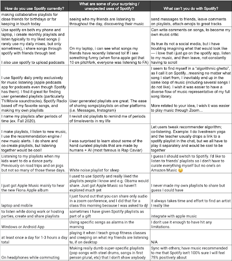
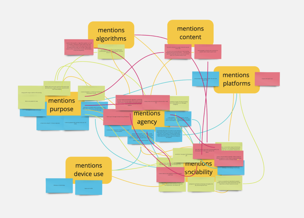
In order to further understand current uses and limitations to Spotify, we designed a pilot survey for an initial sampling of members from our MAS.S67 Fixing Social Media, at first with a small group of peers during our class, and later with the general mailing list after our class. The pilot survey consisted of three central questions: “how do you use Spotify currently?”, “what are some of your surprising/unexpected uses of Spotify?”, “what can’t you do with Spotify?”. We built the pilot survey to collect responses using Google Doc (in-class) and Google Forms (after-class), after which we imported each set of responses into a table. We then used MIRO, an online whiteboard for collaborative work, to code responses for themes using an approach to qualitative analysis resembling an open card sort, in which responses are cards to be sorted by categories to be determined through the sorting, rather than before the sorting. This approach not only allowed us not only to sort cards (responses) by categories (themes) as they emerged, but also map both first-order and second-order connections between cards across the different categories. Additionally, each response in a given set of responses was assigned one of three colors based on which of the three pilot survey questions it submitted as a response to. All of the responses were coded using the same categories, which included whether a given response mentions agency, mentions algorithms, mentions content, mentions platforms, mentions sociability, mentions device use, or mentions purpose. Cards mentioning several of these themes underwent an additional step, in which each of the categories interpreted were ranked by importance. These rankings determined placement of the card on a first category (most important), a first-order connection to another second category (second most important), as well as a second-order connection to another a third category (third most important), where the first-order connection is a line matching the color of the given card (blue, green, red) and the second-order connection is a line matching the color of all the categories (yellow). From this exercise, we found that agency, sociability, and purpose appeared most often in responses, and that most responses were traceable to sociability as either a first-order or second-order theme.
Figure 1: Table of pilot survey responses and qualitative findings from coding exercise.
Part Two: House Party’s Purpose
House Party’s purpose is to enable new forms of emotional connection and deepening of community through music, especially when that connection is not able to occur in the same physical space. This idea sprouted from an experience co-author Elon had while quarantined during the COVID-19 pandemic. Each week, she and a group of friends met over video chat to talk and play games. She was listening to music over her Bluetooth speaker, and her friends could vaguely hear the music through the video chat. Eventually, a song came on that everyone liked, and they all spontaneously began to dance – a dance party that spanned from Nashville, TN to Pensacola, FL to Incheon, South Korea, nearly 7000 miles total. After the song ended, the mood of the group had palpably lifted. This experience helped Elon realize how important music can be in creating bonds, and that it can be a useful tool in connecting people regardless of their location or ability to be together. This revelation inspired her, and she wondered how she might create something that allows groups to connect and bond over music – together, at the same time – even from thousands of miles apart. Thus, the idea for House Party was born, and with it its purpose to bring people together through music – from anywhere and for any reason.
The extension’s name, House Party, has a double meaning. First, it’s a tongue-in-cheek reference to the fact that people all over the world are confined to their homes during a pandemic, such as COVID-19; therefore, any party is quite literally a house party. Beyond this, though, House Party is meant to evoke the feeling of a more traditional house party – a highly social event that brings people together, in which the mood is kept up by music, and where any attendee can hear the same music as everyone else, regardless of their location in the house. Of course, it is worth noting that Houseparty, a video conferencing app, already has a markedly similar name; however, we believe that our extension is truer to the spirit of a house party, and that since it is a music-centric extension rather than a video-centric standalone app, it is sufficiently distinguishable from the Houseparty app.
Platform Infrastructure & Relevant Features
As a digital platform, Spotify relies on a technical infrastructure to sustain its functionality as a both an user application and as a media services provider. In particular, Spotify’s technical infrastructure is built with a microservice architecture, allowing each layer of its platform stack to remain at once maintainable and testable by both software engineers and product developers. In 2011, Spotify introduced Spotify App Finder, a service for third-party developers to create and host apps for use by members who had Spotify Premium. In 2014, Spotify discontinued this space for third-party developers upon introducing a Web Application Programming Interface (API), which it claimed would fulfill many of the advantages to App Finder. In this time, spaces for synchronous playback experiences had emerged on the Spotify platform, through the group listening rooms of Soundrop, a third-party app around which a community formed. However, because the App Finder API had been discontinued, Soundrop was forced to close. As a result of this closure, efforts to build open-source alternatives, such as Soundbounce, were soon formed yet inevitably relegated to remaining standalone players, in which Spotify Premium members have to log-in through a separate app, until Spotify enables developer support for apps in their Web player. In the six years since then, Spotify has yet to have made this decision.
As a digital platform, Spotify currently offers three features that are relevant to our proposed intervention. First, Spotify publicly allows synchronous “group sessions”, in which users can add songs to a shared song queue with a limitation of one device playback at any time. Second, Spotify publicly allows asynchronous “collaborative playlists”, in which users can add songs to a shared song list which multiple devices can playback at any time. Third, Spotify privately allows synchronous “social sessions”, in which users can add songs to a shared session, multiple devices can playback, and invite other users to listen along together at once, wherever they are. Despite this feature being most relevant to our extension, it’s only usable for Spotify employees.
User Journey & Use Cases
House Party is designed with two primary use-case-types in mind. However, we envision two additional use-case-types that could be implemented with additional functionality, perhaps in a subsequent update to the extension. The primary use-case-types can be characterized broadly as one-to-one and many-to-one, and the envisioned future types can be characterized as one-to-many and many-to-many.
Primary Use Case 1: One-To-One
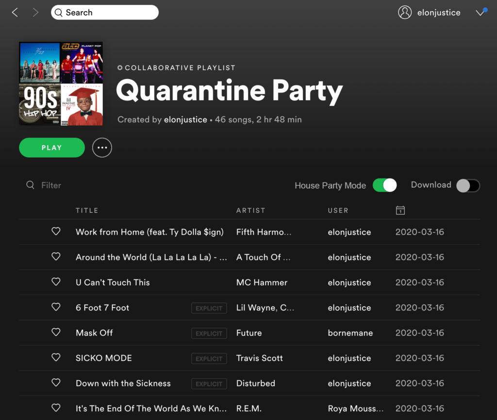
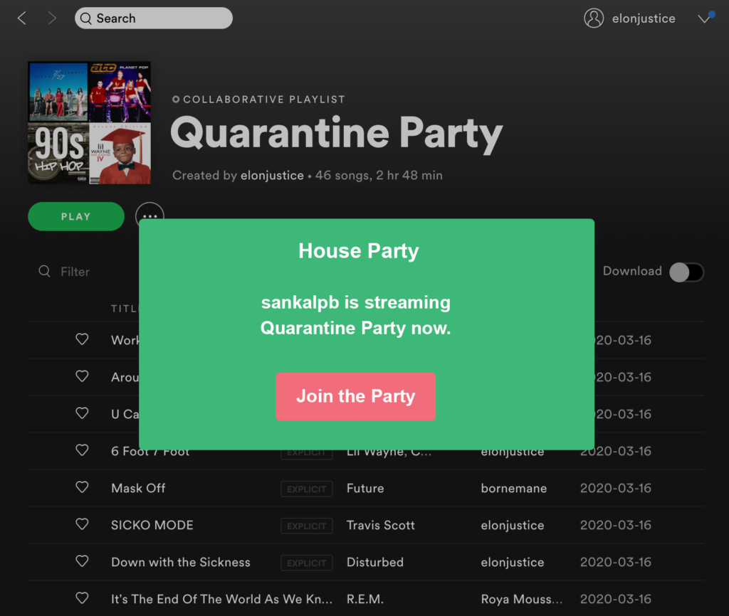
In a one-to-one case type, a group of users are given access to a collaborative Spotify playlist. Users with editing access may add and remove songs in the playlist (as is currently the case with Spotify’s ‘collaborative playlists’ feature), but these users also all have the ability to turn House Party Mode on or off. When House Party Mode is on and a user hits play on the playlist, all users with access will receive a push notification to “Join the Party.” Any user who then tunes in will then hear the playlist simultaneously with other users. Anyone with access may queue up or skip songs, or play or pause the music. This will remain the case until House Party Mode is turned off.
A first imagined use case within this type is that of a party among friends, thrown over a video chat app such as Zoom or Facetime due either to distance or inability to congregate. Before the party, one friend would create a collaborative playlist and invite all their friends to contribute songs. During the party, each friend could hear the same music from their respective speakers as they chat, and any friend could skip a song, pause the music, or queue up a song they’d like to hear. A second imagined use case within this type is that of a couple in a long distance relationship who would like to feel connected to one another as they go about their daily routines. Each partner would contribute to a collaborative playlist with songs they both enjoy or that they would like to introduce to the other, and they would listen together as each partner gets ready for work in the morning.
Primary Use Case 2: Many-To-One
In a many-to-one case type, multiple users can access, edit, and control the playlist in the same way as a one-to-one case type. However, in this case, another user can stream the playlist without having these same privileges. Those with control privileges would access the playlist through the collaborative playlist function, and any of them may turn House Party Mode on, queue up or skip music, etc. The user without control privileges would access the playlist by a link, subscription, or search (if it is publicly searchable within Spotify). When House Party Mode is turned on, all those who are collaborators (with control privileges) and the listener (if subscribed to the playlist) would receive a “Join the Party” notification.
An imagined use case within this type is a group of friends gifting a Spotify playlist to another friend for their birthday. All those gifting the playlist would contribute to the collaborative playlist, and once it was complete the group would send a link to the playlist to their friend. The group would agree on a time to listen together, and the friend whose birthday it is would be delighted at all the songs their friends have chosen to play.
Future Use Case 1: One-To-Many
In a one-to-many case type, only one user has access to the playlist and therefore is the only one with the ability to add and remove songs, turn House Party Mode on and off, and queue up, skip, play, or pause the playlist. Other users may reach the playlist through a link or subscribe to the playlist (if it is publicly searchable within Spotify), but they cannot make any changes; however, those who are subscribed will receive a “Join the Party” push notification when House Party Mode is turned on. The “host” user can publicize the time they planned to stream the playlist so that other users knew the time to tune in.
Imagined use cases in this category are well-known local or national DJs compiling a list of songs for a Friday night quarantine dance party and artists hosting live listening parties for their new (or old and well-loved) albums.
Future Use-Case 2: Many-to-Many
Finally, a many-to-many case type would operate in mostly the same way as a many-to-one case type, except that multiple listeners may synchronously stream the playlist instead of one. As in the previous case, any user with control privileges can turn House Party Mode on and off, queue up or skip music, etc. Users without control privileges may access the playlist by a link, subscription, or search (if it is publicly searchable within Spotify). Furthermore, any of the host users may publicize the time they planned to stream the playlist so others knew when to tune in.
Imagined use cases in this category are groups of friends creating a playlist to stream to their wider friend circles and multiple artists co-creating and streaming a playlist for their fans.
Of course, House Party’s capabilities should not be limited to these particular use cases. Certainly, the extension’s target audience is known for their creativity and ingenuity, and there is no limit to the situations in which they can apply it. These use cases are simply a jumping-off point, with the four broad types serving to showcase the extension’s functionality in different situations.
Intended Experience
As previously stated, the purpose behind this intervention is to create a new avenue for connection and community through music, especially in times when groups are unable to be together physically. The technical goal of the project is to successfully function atop Spotify’s existing user interface while providing users a new option in their experience of the platform. Success in reaching both of these goals may be measured in how well House Party meets several objectives. Objectives measuring success include the following:
- Number of users who install the extension
- Number of users who use the extension on a daily, weekly, or monthly basis
- Variety of use cases in which the extension is implemented (determined by surveys)
- Overall user satisfaction with the extension (determined by surveys)
- Sense of deepened community and social bonding between users (determined by surveys)
- Regularity of bugs or crashes which make the extension difficult or impossible to use
- Legal or technical issues that arise with Spotify that make the platform inhospitable to the extension
Limitations, Implications, & Future Directions
Certainly, the House Party extension has a number of limitations, implications, and avenues for improvement. A major limitation of the extension in its current state is that it works best with Spotify Premium (which costs $9.99 per month)17 and would not work as well with Spotify Free. This is because Spotify Free users only have access to a limited number of song skips per hour and must listen to an ad after a certain number of consecutive songs.18 If users with Spotify Premium listened synchronously with a Spotify Free user, it is likely that the entire group would have to listen to the ads alongside them, and the Free user would be unable to access the full functionality of the House Party extension without the ability to skip songs. Another limitation is that House Party can’t access songs outside of Spotify’s existing library. This means that as far as the extension could enable sociability, the diversity of music itself would be determined by the catalogue of artists and albums made available through Spotify.
House Party brings foreseeable implications as well. First, the extension may further entrench people in the music preferences of their existing networks or the social groups with which they identify. We believe this concern could be resolved in part by using in-app prompts from Spotify that suggest music from music or artists outside the collective preferences at play when House Party mode is turned on. Second, this extension could become another way for trolls to access or to otherwise cause harm to communities. We believe this concern could be resolved in part through increased security around playlist link sharing such that when using House Party is in use and a playlist is shared with different listeners or users, they are brought into a waiting room before being allowed access to editing capabilities of the playlist. We believe implications like these have become part and parcel of designing social media, in a world where various online platforms have come to face nearly identical concerns in recent years.
Finally, a number of future improvements could be made to this extension. First is additional functionality that would allow our envisioned future use-case-types to be viable, as the extension is currently designed to work best on a small scale, likely with groups who know one another personally. Future improvements could allow the extension to scale up and work for mass audiences so that artists, DJs, or others with large followings could stream to all their fans at once. This could also include the addition of a comments feature, perhaps similar in form to Facebook Live, where listeners could make requests, reach out to the host(s) with comments, or discuss the music with other listeners. A second future improvement is that of an algorithm that enables the extension to do more of the work of ordering and fitting songs together in a playlist so the music flows together smoothly: Although the users would retain total agency of the songs within a playlist, the extension would reorder the songs for a more seamless listening experience. Of course, some users may feel uncomfortable with the use of an algorithm in any form, so this feature would remain entirely optional.
References
- Understanding Spotify: Making Music Through Innovation, Goodwater Capital, March 15, 2018, https://www.goodwatercap.com/thesis/understanding-spotify#important-disclosures.
- Mansoor Iqbal, “Spotify Usage and Revenue Statistics (2020),” Business of Apps, April 24, 2020, https://www.businessofapps.com/data/spotify-statistics/.
- Kelli White, “How to Attract and Engage Millennial Attendees for Your Event,” Event Manager Blog, October 17, 2018, https://www.eventmanagerblog.com/how-to-attract-millenials-for-event.
- Jill Suttie, “How Music Bonds Us Together,” Greater Good Magazine, June 28, 2016, https://greatergood.berkeley.edu/article/item/how_music_bonds_us_together.
- Brittany Hodak, “New Study Spotlights Gen Z’s Unique Music Consumption Habits,” Forbes, March 6, 2018, https://www.forbes.com/sites/brittanyhodak/2018/03/06/new-study-spotlights-gen-zs-unique-music-consumption-habits/#22b9970d42d0.
- Spotify for Brands, “Culture Next,” Global Trends Report, no. 1 (2019): 1-19. https://www.spotifyforbrands.com/en-US/insights/millennial-guide/
- Spotify for Brands, “Culture Next,” and Brittany Hodak, “New Study Spotlights Gen Z’s Unique Music Consumption Habits.”
- Mansoor Iqbal, “Spotify Usage and Revenue Statistics (2020).”
- Data collected in pilot survey conducted April 29, 2020.
- Kristi Kellogg, “The 7 Biggest Social Media Sites in 2020,” Search Engine Journal, February 3, 2020, https://www.searchenginejournal.com/social-media/biggest-social-media-sites/#close.
- Understanding Spotify: Making Music Through Innovation.
- “Music and Podcasts, Free and On-Demand,” Pandora, accessed May 2, 2020, https://www.pandora.com.
- “Creators on SoundCloud,” SoundCloud, accessed May 2, 2020, https://creators.soundcloud.com.
- Understanding Spotify: Making Music Through Innovation.
- ibid.
- ibid.
- “Spotify,” Spotify, accessed May 2, 2020, https://www.spotify.com/us/premium/.
- Henry T. Casey, “Spotify Free vs Premium: Should You Pay to Play?,” Tom’s Guide, March 28, 2019, https://www.tomsguide.com/us/spotify-free-vs-premium,news-24850.html.
