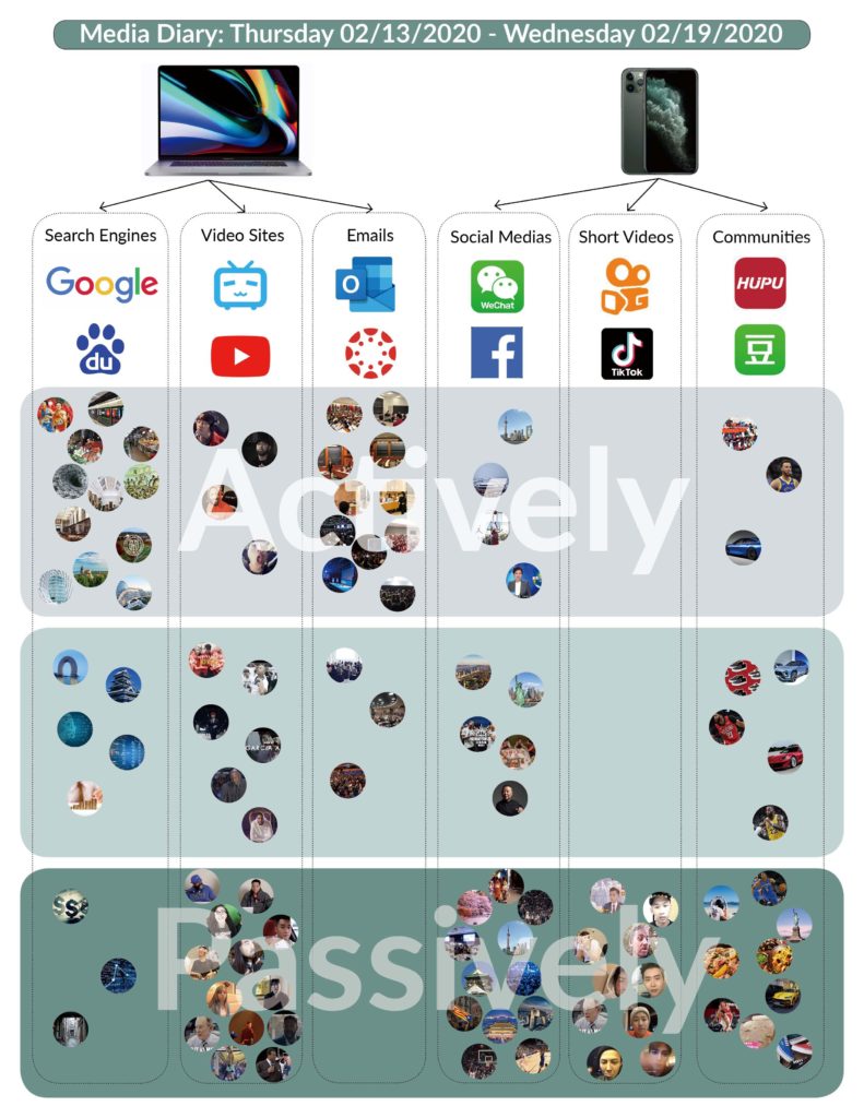
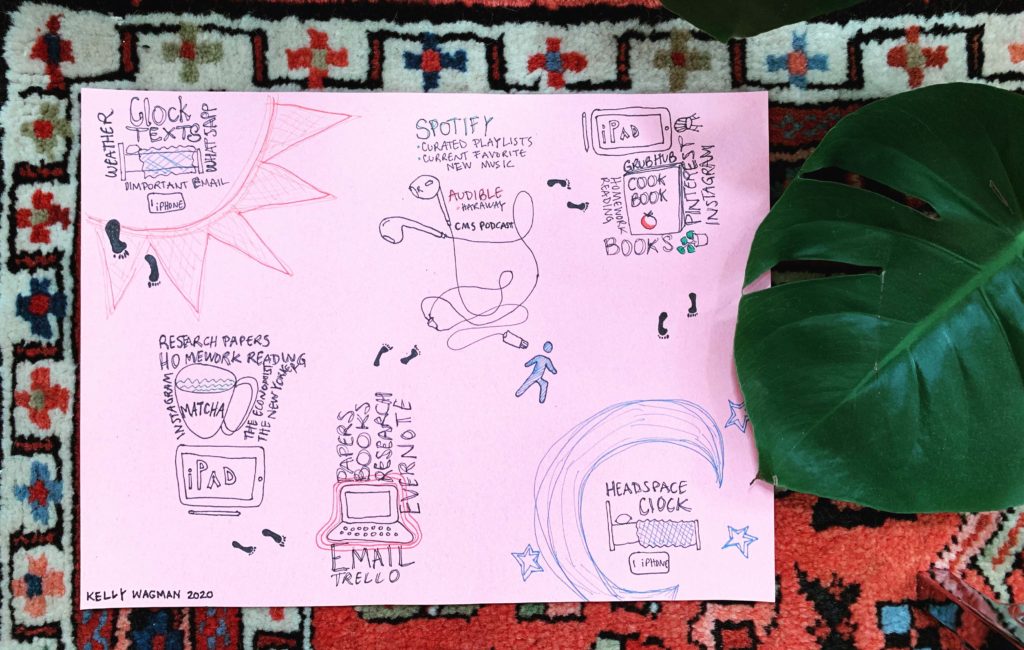
I discovered a temporal quality to my media consumption. Above, I show word clouds for different parts of my day along with the corresponding media I use. Larger font size correlates with higher use. I also couldn’t help the urge to Instagram-ify the media chart as a kind of meta-commentary about creating media about our media. I specifically chose to use “millennial pink” and plants in the final piece and ran the photo through the Juno Instagram filter.
Tag: Assignment 2
Assignment 2: Media Diary
My Media Menu
I hoped to track my media consumption this week as seamlessly as possible. To achieve this goal, I sorted through a list of options in the Chrome Extension store and ultimately installed Webtime Tracker. This app tracked the hours I spent on websites from my Chrome browser. I had never done something like this so I was excited to see the outcomes from one week’s worth.
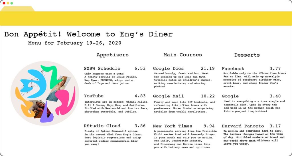
Using the aggregated data from the past seven days, I decided to construct a Media Menu. The Main Courses included the top three websites I spent the most time on, the Appetizers had the next top three and the Desserts contained the next top three. The prices reflect the percentage of time I spent on that particular website.
While the results weren’t too surprising, they compelled me to look through my media consumption again and write a more condensed version of the types of media consumed from that platform or website. From this long and windy process, I was reminded that I watched mostly YouTube interviews, that I listened to mostly new music from SXSW artists, and that I spent an enormous amount of time on statistics programs and resources for my one class.
Bon Appétit!
Assignment 2: Media Diary
My data was tracked during a busy week with my work. I am sure the story and insights from my data will change depending on the timing.
For this exercise I turned on data tracking for my activities by google services. I also used the data logged through my iOS devices. For the visualizations I used vizd.at a data vis tool in beta mode that is mostly aimed for discussing interactive data online. Hover over a vis to see more info, click on it to reproduce or use the visualization. If you download the plugin from here you’ll be able to comment with a visualization or reproduce my visualization.
General Insights
By Device
I was surprised to see how much I’m using my laptop! I guess I’m really doing work, yay!
By Media (or App?) and Device
Highest apps in ranking are those that help me in my work. I was surprised to see that I spent so much time learning github’s Classroom Assistant for this class I’m TAing. We don’t actually use the tool but I like exploring new “unnecessary” tools. (as we’ll see in a few T_T) As for my phone, I’m clearly using it to have fun and log data using Day One. I used Sephora and NetaPorter for “window” shopping online. Online Shopping is the most calming thing to do when i just don’t want to deal with any controversial or sensitive media.
By Category
To sum up the general insights I wanted to see my data aggregated by category and as we see my productivity is doing well, but then we have this “browser” category which required more investigation.
What Exactly is Going on?
Diving deeper into my “Browser” data which is mainly my activity on google, we see that I have 4 categories: Tools, Search, Social Networking, Shopping (different from app shopping), Entertainment.
Another view for the same data, I noticed that I’m spending way to much on the category “Tools” almost every day except for Wed and Tue!
The following vis is a level deeper looking at “Tools”. When we have we can see that the most cluttered days are Feb 21 and 20. And those are the day in which I dedicate to prepare for the recitation for the class I’m TAing.
As shown in the vis bellow, codepen and github are the highest in number of occurrences and those are the ones I use for the recitation. The other tools makes me kinda sad. I’m searching for a good tool for collecting and analyzing qualitative logs. I have been trying a lot of tools. Non of which is recommended to me by ads or bots! where are those bots and algorithms when we need them.
Was my media consumption my choice?
Hell yeah! Every single logged data was intentional and i wan’t surprised. I was just surprised the amount of days spent. I also checked my “ads” log which could be tracked by google and it was empty. I watched hulu but it was an old show I’m rewatching. Every single choice of media consumption is intentional. I also noticed I don’t used social media that much!
Also, as I predicted and as my log showed me, I don’t read news. Not that I don’t care but it’s just saddens me how some journalists and media outlets only care about the controversy of their reports as opposed to the accuracy, context and full picture. Reading news from news outlets is draining. I mostly don’t care about politics so my source is usually twitter, youtube and other people.
a diary of media consumption
For my media diary, I chose to track all of my consumption of media that were readable or audible artifacts intended to be seen or heard outside of 1-1 communications (i.e. iMessages were not counted, but email newsletters were). From there, I translated each hour (roughly) of my media consumption into a one-count movement fundamental, so that each day could be represented with three eight-counts of dance. I chose to perform my dance to the accompaniment of only a metronome to keep the focus on the movements, which are encoded as follows:
- Gazing down = sleep time
- Gazing up = awake but not actively mediated, such as while sitting in class, skiing with friends, or just talking to real live people!
- Head movements = passive listening or reading, such as background music / TV or ads in the T station
- Arm movements = voluntary, entertainment-focused listening or reading, such as scrolling through Twitter or listening to a podcast
- Leg movements = less voluntary, utilitarian listening or reading, such as looking up walking directions or reading a restaurant menu
- Movements of both arms indicate media multi-tasking, such as watching Netflix while checking Instagram
Finally, I sped up my video into a more digestible loop. I chose not to represent my mix of digital vs. printed media consumption because it was almost all digital, except for on day 1 which was also my phone-free day, but wish I had found a creative way to incorporate that into my visuals as well.
For the Excel lovers, I have included my choreography spreadsheet for reference.