Categories
Uncategorized

Cloud of Media

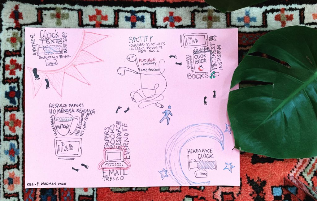
I appreciated this assignment because it encouraged me to reflect on how I recently redefined the applications that I use in spare time, and that I unknowingly drift towards as I go throughout my day. For this past week, I have actively switched my “default” app from Messenger and then Gmail to the New York Times App and then the Books app. While I did not track my time spent on these apps, it was easy to find through the Screen Time feature on iOS. In order to make the data collection concise yet meaningful when Screen Time exists, I recorded which applications or websites were entry points.

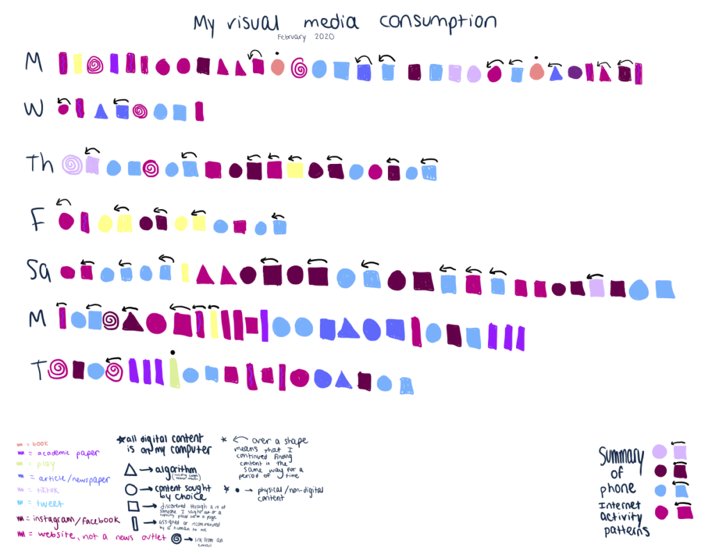
My data collection process was simple, I recorded the approximate time spent on media found through a variety of these initial leads on media, and captured my data in a graphic, below. The graphic was generated by converting the time spent on each entry point’s media sources into a transparency percentage according to a logarithmic scale, and modified the icon for that app or site. Perlin noise was added to create a noise floor, a point where features of images would become invisible. In order to make it so that each logo was visible in proportion to the amount of time I spent through it, I generated a cloud of 600,000 dots (one dot for every second of this past week), in order to have an equal baseline for visibility of each of the logos. This cloud of media consumption, I’ll call “Cloud of Media”.

While not all of the applications are visible, from right to left and moving down, there are Google Docs, Firefox, Youtube, New York Times, Apple News, Google Chrome, Reddit, Apple Books, Safari, Spotify, Dropbox, Simple Radio, Twitter, and a game title.

The image format conflicts with WordPress due to how large and difficult to compress it is, so the Cloud of Media can be found at: https://www.dropbox.com/s/u0w0011joqfiqnm/cloud_of_media.png?dl=0

Categories
Uncategorized

My media diary

I discovered a temporal quality to my media consumption. Above, I show word clouds for different parts of my day along with the corresponding media I use. Larger font size correlates with higher use. I also couldn’t help the urge to Instagram-ify the media chart as a kind of meta-commentary about creating media about our media. I specifically chose to use “millennial pink” and plants in the final piece and ran the photo through the Juno Instagram filter.

Categories
Uncategorized

Assignment 2: Media Diary

I used software to track my time: I tracked app usage through Screen Time, desktop browser usage through an app called “Clockify”, Apple Podcasts to track which Podcasts I listened to, and a Google Sheet to track TV, reading, and video game time.

Inspired by Ethan’s exhortation to avoid using Microsoft Excel to visualize our media diet, I decided to use Microsoft Excel to visualize my media diet. I remembered reading about the Japanese artist Tatsuo Horiuchi using Excel to create paintings with the Autoshape tool, and tried to create something similar. Unfortunately, making beautiful art is hard:

In this painting, I represented the amount of time I spent consuming media with various items in a landscape. The overall canvas size represents all the time in one week. Each item’s size roughly corresponds to the amount of time spent on that activity. The grass represents time spent sleeping, the sun represents time spent on social media, and the Reading Cow represents time spent reading news, books, or papers. True to the Excel form, I turned the sun into a pie chart. The sizes are inexact: I tried to write some VBScript to calculate the area of an arbitrary polygon but this turned out to be nontrivial, so I decided to spend more time sleeping instead.

One valuable lesson I learned from this exercise is that I do not have the patience or artistic skills of Tatsuo Horiuchi. Another is that I spend a lot of time on Twitter, which is a website that makes me unhappy, and that I should stop doing that.

Here’s the spreadsheet, if you’re interested. The art looks bad in the Google Drive viewer, but if you have Excel you can download the .xlsx file and open it.

Categories
Uncategorized

Assignment 2: Media Diary

Categories
Uncategorized

Assignment 2: Media Diary Visualization

I decided to visualize how I was introduced to content and what kind of content I interacted with over the course of a week. The data was mostly visualized chronologically over the course of each day. I collected data for 9 days, but only chose to visualize 7 in my graphic (I worked on a take-home midterm all day on Sunday so my data was not that interesting). My visualization was inspired by Dear Data, a year-long analog data project between two friends. I did not include messages, email, or numerous instances of engaging with an academic website like Piazza or Canvas in my collected data. I did include academic readings online such as an online textbook. I included links that I clicked on through google searches but not the searches themselves. My visualization is not totally comprehensive as it does not indicate how long I interacted with content. I spent much more time on academic readings than on Twitter, but I have many more instances of Twitter content. I focused more on how I discovered the content than how many Tweets or TikToks (for instance) I interacted with – if I interacted with numerous Tweets in the same way, I simply drew one shape with an arrow drawn over it. It was funny to see my habit of going to check a specific account whose information I enjoy reading when I need to fill a gap of time or want to distract myself, and then scrolling through that account and going down an Internet rabbit hole visualized. I indicated if I chose to find or interact with content, but I did not describe why – to fill time, to answer a question, to distract, etc.